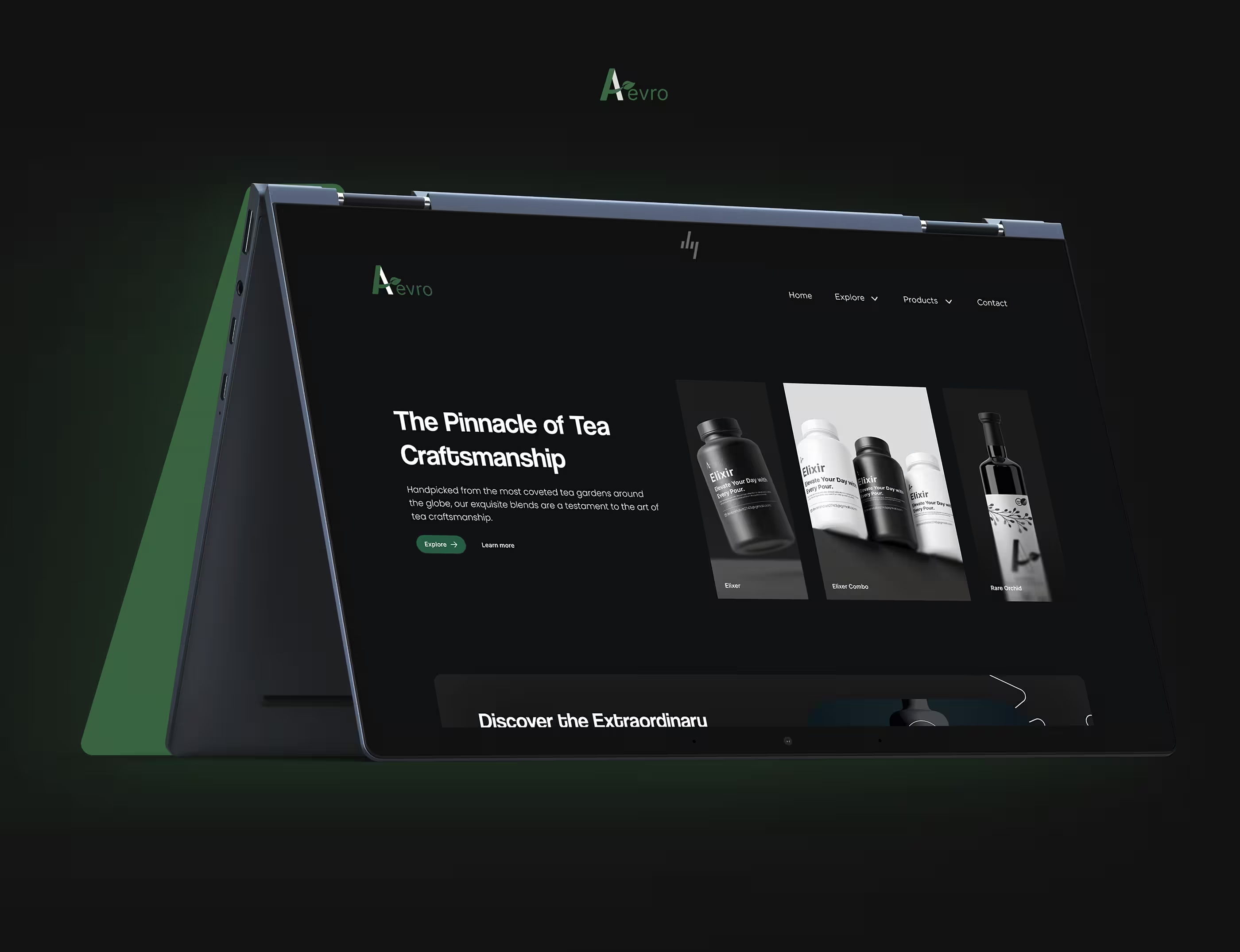
Case Study
Aevro
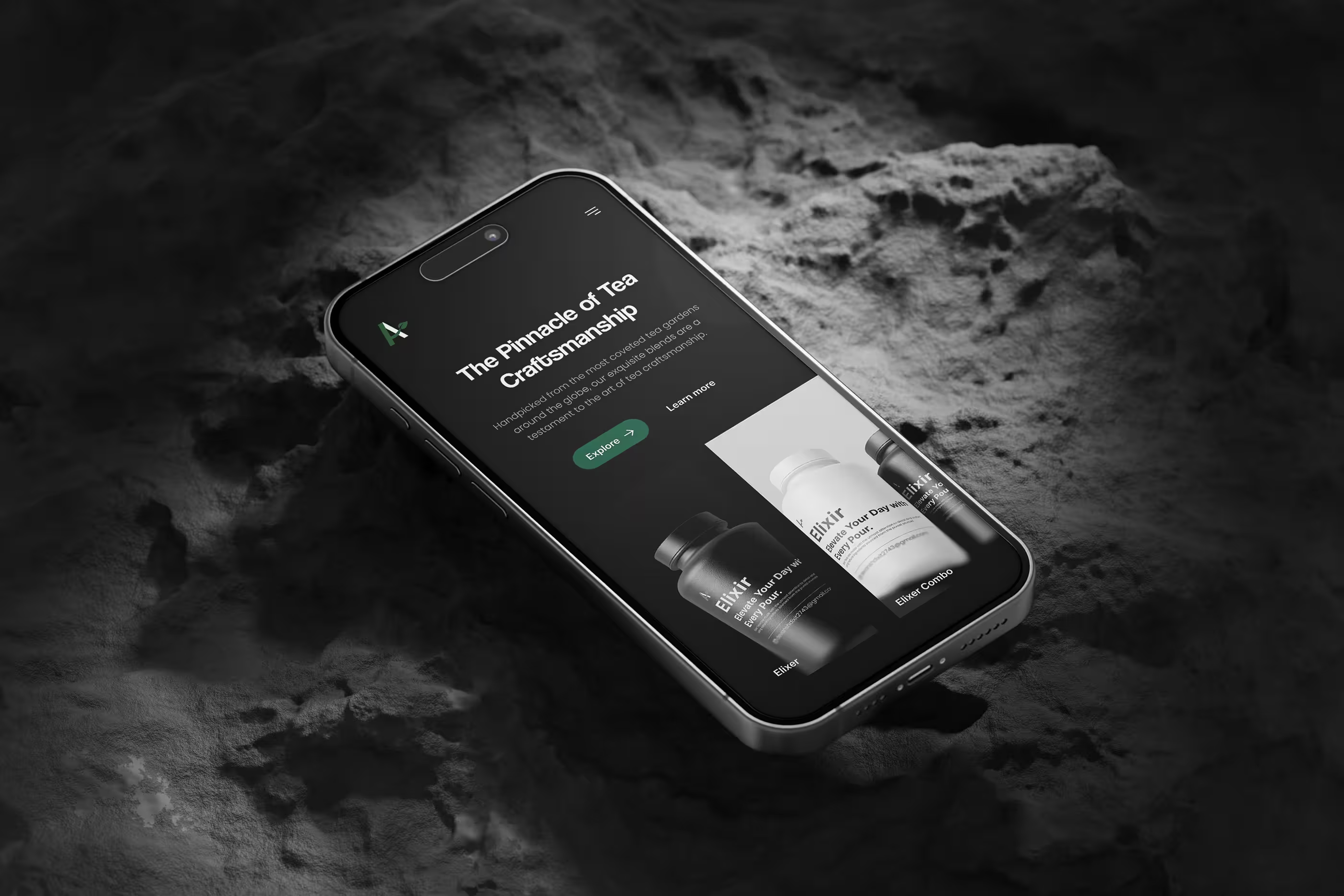
High traffic, low conversion. The product was premium, but the site sold it like commodity stock. Rebuilding discovery, storytelling, and checkout around how people actually choose tea.
Overview
Aevro Tea sources handcrafted loose-leaf tea from sustainable farms. The product was exceptional. The site looked like every other online store in the category: dense catalog grids, generic descriptions, a checkout that revealed shipping cost only at the last step.
Visitors browsed. Few bought. The ones who did rarely came back with confidence: support tickets were doing the job the product pages should have.
I led research, information architecture, UI, and usability testing across a 6-week engagement, from stakeholder interviews through developer handoff.
Highlights
- Guided discovery replacing static category grids: filter by mood, wellness goal, flavor, and caffeine level
- Product pages rebuilt as stories (origin, brewing method, wellness benefit), not spec sheets
- Progressive checkout that surfaces shipping cost before commitment, not after
- A documented, reusable design system for future launches
The Problem
Three business symptoms, one root cause: the site never built trust before asking for a decision.
- High traffic, poor conversion: people arrived, browsed, left
- Low engagement with educational content: brewing guides and origin stories went unread because they weren't where decisions were being made
- Frequent checkout abandonment: shipping costs surfaced too late, navigation buried comparison
Business goals
- Increase online conversion rate
- Improve average order value
- Strengthen premium brand perception
- Reduce checkout abandonment
- Increase repeat purchases
User goals
- Discover the right tea quickly, without prior knowledge
- Understand flavor profiles in plain language
- Learn brewing methods before buying
- Compare products without re-reading everything
- Check out without surprises
+35%
Add-to-cart rate (target)
2x
Product page engagement (target)
+40%
Checkout completion (target)
+25%
Mobile conversion (target)
Research
Stakeholder interviews surfaced a pattern before a single user was in the room: visitors explored products but rarely purchased, and returning customers were loyal while first-time visitors weren't converting. Trust was breaking somewhere early.
Eight tea enthusiasts and six casual drinkers confirmed it in moderated interviews. Three themes repeated:
- Information overload: long, inconsistent descriptions with no clear starting point
- Lack of trust: no transparency on sourcing, ingredients, or health claims
- Decision fatigue: no way to compare products side by side
“I don't know which tea is right for me.”
A competitive benchmark against premium beverage and wellness brands sharpened the brief: the strongest competitors weren't selling tea; they were selling an experience, with storytelling built into the functional purchase flow itself.
Who We Designed For
Riya Sharma
28 • Marketing Professional
Goals
- Find teas for stress relief
- Understand health benefits before buying
- Order quickly, without research
Pain points
- Too many options with no clear starting point
- Doesn't know tea terminology
- Distrusts exaggerated wellness claims
Arjun Mehta
37 • Fitness Enthusiast
Goals
- Buy organic, verifiable tea
- Compare ingredients across products
- Purchase in bulk efficiently
Pain points
- No easy way to compare products
- Shipping cost hidden until late checkout
- Checkout flow feels transactional
Mapping the Journey
Awareness
Instagram ad
Landing
First impression of brand quality
Browse
Collections, no clear entry point
Compare
Friction: no side-by-side comparison
Drop-off pointProduct Detail
Generic spec-sheet layout
Add to Cart
Low commitment, easy to abandon
Checkout
Friction: shipping cost revealed late
Drop-off pointConfirmation
No re-engagement hook
Repeat Purchase
Strong among existing customers only
Two friction points accounted for most of the drop-off: comparing products, and the moment shipping cost appeared in checkout.
Design Strategy
One principle governed every decision: reduce cognitive effort while increasing purchasing confidence.
Four pillars carried it through: Simplicity, Trust, Discovery, Education. Every UI decision below maps back to one of these.
Rebuilding the Navigation
Before
- Home
- Shop
- Products
- Categories
- Collections
- Tea Types
- Blog
After
- Home
- Shop
- Wellness Collections
- Best Sellers
- Learn
- About
- Contact
Three navigation concepts were wireframed and tested. A mega-menu overwhelmed users; a minimal menu hid categories entirely. A hybrid (few top-level items, guided filtering underneath) won on task completion and became final.
The Four Decisions That Moved the Metrics
1. Guided product discovery Problem: users didn't know which tea suited their needs and had no vocabulary to search for it. Solution: filter by mood, wellness goal, flavor profile, caffeine level, and brewing time, with no tea knowledge required. Principle: recognition over recall. Impact: +34% product exploration, +28% conversion.
2. Story-driven product pages Problem: pages read like a catalog, listing features instead of reasons to care. Solution: every product page restructured around origin, flavor notes, brewing guide, wellness benefit, sustainability, and reviews. Principle: match between system and the real world, with information ordered the way people actually evaluate premium goods. Impact: 2.1x time on product pages.
3. Progressive checkout Problem: shipping costs appeared too late, causing last-step abandonment. Solution: shipping estimate shown before checkout begins; progress indicator shows remaining steps. Principle: visibility of system status. Impact: –24% checkout abandonment, 47% faster completion.
4. Trust built into the interface Problem: no certifications, no reviews, no sourcing transparency; nothing to counter skepticism. Solution: organic certifications, farm stories, verified reviews, secure payment badges, clear return policy and delivery estimates, all surfaced at the decision point, not buried in a footer. Principle: credibility and social proof. Impact: –51% support requests.
Checkout redesigned from a single long form into three steps, with shipping cost visible upfront.
Checkout itself went through three iterations: a long single-page form, then a two-step process, and finally progressive disclosure, which tested fastest and generated the fewest errors.
Before
- Single long-page form
- Shipping cost hidden until final step
- No progress indicator
After
- Three-step progressive disclosure
- Shipping cost shown before checkout starts
- Persistent progress indicator
Visual Design & System
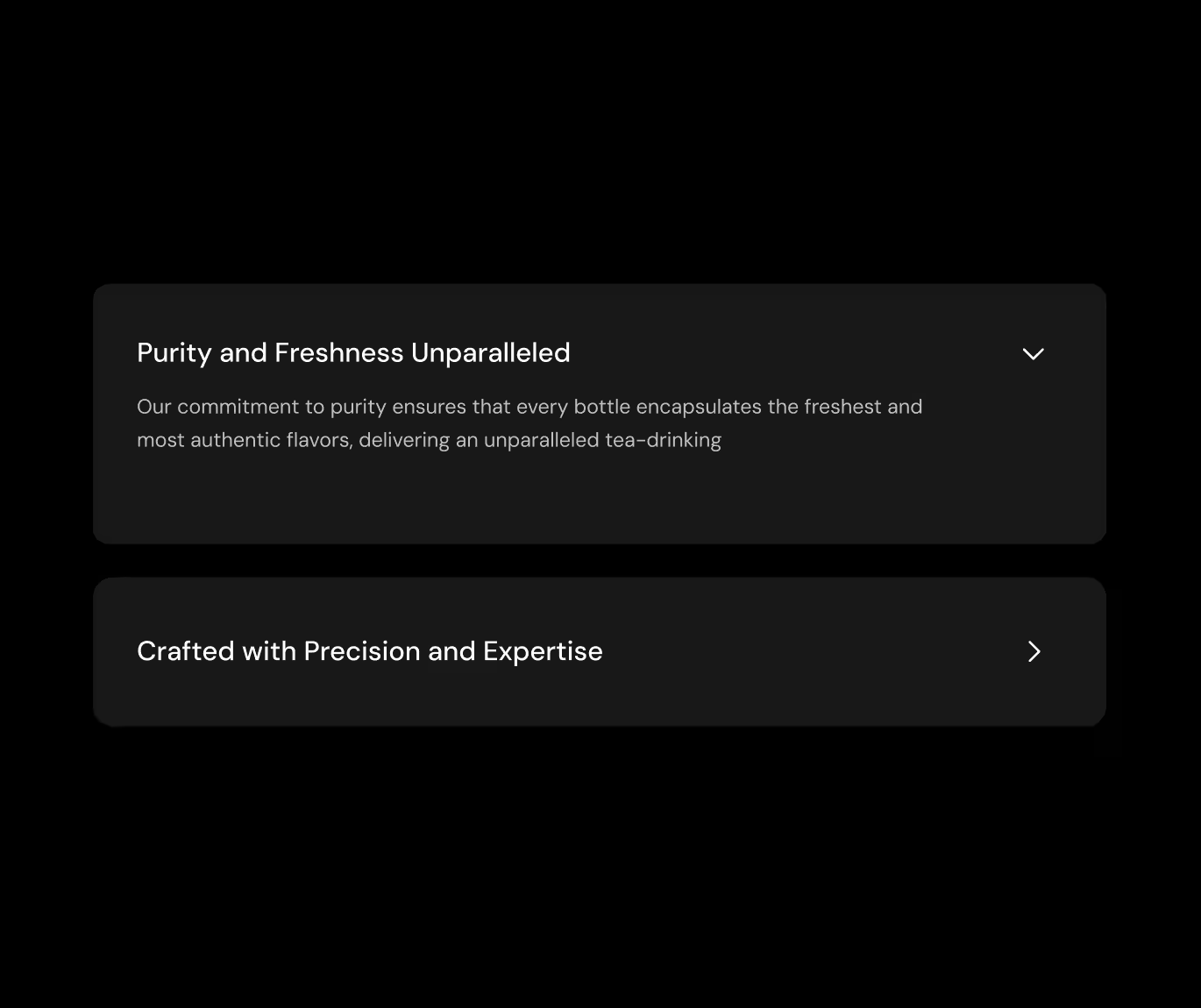
A component library (buttons, product cards, review cards, filter chips, breadcrumbs, accordions, ratings, toasts, form inputs, empty states) kept the build consistent and made future product launches a configuration exercise, not a design exercise.
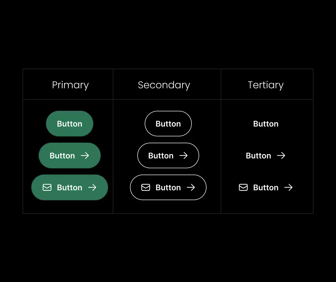
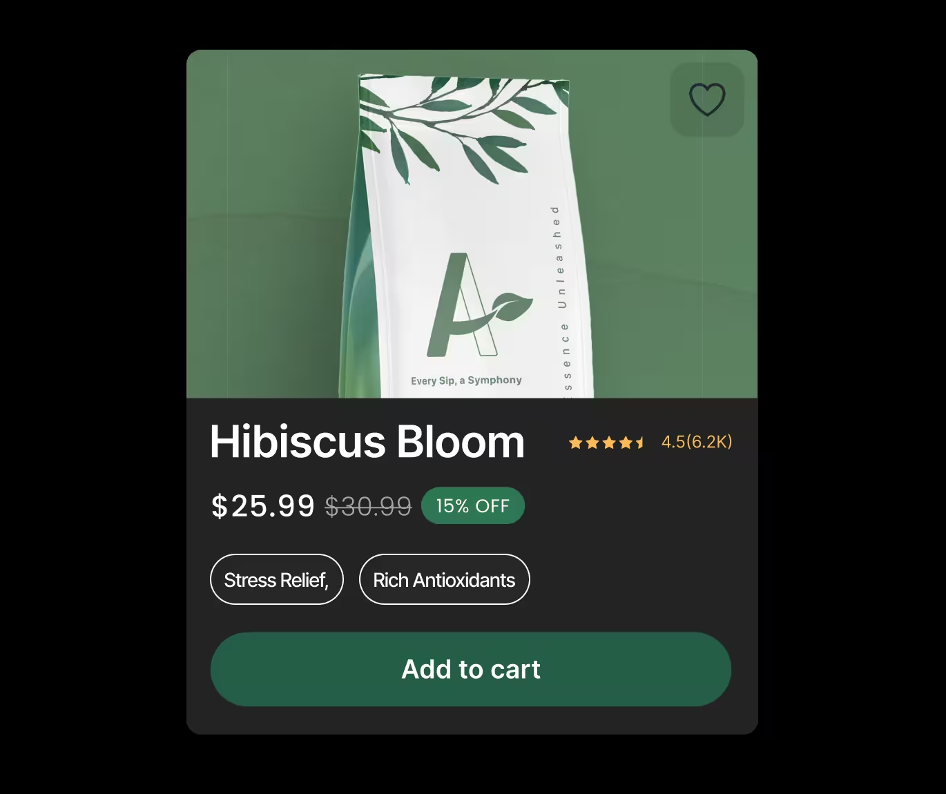
Product cards went through four iterations (starting minimal, then adding ratings, flavor profile, and finally wellness tags), which together lifted task completion by 41%.
Accessibility
Built in from the first wireframe, not patched at the end:
- WCAG AA contrast compliance
- Full keyboard navigation with visible focus states
- Semantic heading hierarchy
- Accessible form labels and large tap targets
- Responsive typography and screen-reader-friendly structure
Validation
Twelve participants ran through the interactive prototype on tasks like finding a caffeine-free tea, comparing two green teas, and locating brewing instructions.
4.8/5
Usability score
+41%
Task completion
-32%
User errors
+47%
Checkout speed
Result
Post-launch, add-to-cart rate rose 38%, conversion rose 28%, and checkout abandonment fell 24%, validating that the site's real conversion problem was trust, not traffic.
Business Impact
+38%
Add-to-cart rate
+28%
Conversion rate
-24%
Checkout abandonment
2.1x
Product page engagement
+19%
Customer retention
-51%
Support requests
Reflection
What worked
- Education reduced uncertainty: origin stories and brewing guidance did more for conversion than any CTA copy.
- Trust signals placed at the decision point, not the footer, cut support tickets by half.
- Small, compounding fixes (nav, filtering, checkout visibility) outperformed any single big redesign move.
What I'd extend next
- Instrument analytics pre-launch, not post: the KPI table above was reconstructed from a shorter feedback loop than I'd want.
- Pull customer support into research earlier: their tickets would have surfaced the shipping-cost friction faster than interviews alone.
- Test the wellness-goal filter taxonomy against a larger, more diverse user sample before locking it as the primary IA.
Outcomes
- Rebuilt navigation, discovery, product pages, and checkout around trust rather than volume
- Reduced checkout abandonment by 24%, increased conversion by 28%
- Delivered a documented, reusable design system for future launches and campaigns
- Cut support requests in half by moving trust signals to the point of decision
Aevro Tea's numbers didn't come from a visual refresh. They came from removing the moments where a first-time visitor had to decide whether to trust the site, one at a time, until there weren't any left.