Case Study
SpaceOnAI
Redesigning an enterprise workplace booking experience for faster navigation, smarter AI recommendations, and better employee productivity.
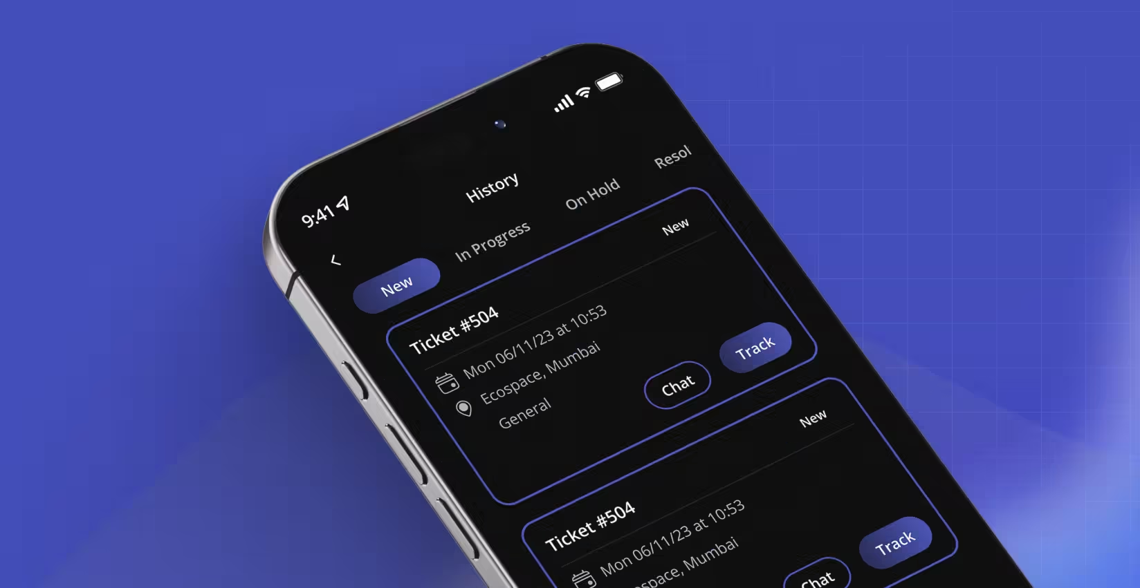
The ticket chat flow, from raising a service request to tracking it through resolution.
Overview
SpaceOnAI is an AI-powered workplace management platform for desks, meeting rooms, parking, and workplace resources, booked through intelligent recommendations based on availability, preference, and usage patterns.
The product was capable. The app no longer looked or felt like it. The interface had aged, navigation took more effort than it should, and the experience had stopped reflecting the sophistication of what the platform actually did. This wasn't a screen-by-screen refresh; it was a full modernization of the product experience.
Project details
- Role: UI/UX Designer
- Platform: Mobile (iOS & Android)
- Industry: Enterprise SaaS / Workplace Management
- Users: Corporate Employees
- Company: Smarten Spaces
Tools
The Problem
SpaceOnAI had grown feature by feature, used daily by thousands of employees across multiple organizations. But every new capability had been bolted onto an interface that was never restructured to hold them.
- Outdated visual language reduced perceived product quality
- Navigation hierarchy was inconsistent across booking workflows
- Important actions required too many interactions
- AI recommendations lacked visibility and context
- Information density increased cognitive load
- Inconsistent components reduced interface predictability
- Limited visual hierarchy made scanning difficult
Internally, the same feedback kept surfacing: the product looked outdated next to competitors, new users needed hand-holding to get comfortable, and the interface no longer matched the company's AI-driven positioning.
Business goals
- Modernize the visual identity
- Increase engagement with AI-powered recommendations
- Improve daily employee productivity
- Reduce navigation complexity
- Strengthen enterprise product perception
User goals
- Book resources quickly
- Understand AI recommendations
- Navigate confidently
- Complete recurring tasks efficiently
- Access workplace information with minimal effort
+36%
Feature adoption (target)
+44%
Task completion rate (target)
-40%
Booking completion time (target)
+52%
AI recommendation usage (target)
Research & Discovery
This was a redesign of an established enterprise product, not a greenfield build, so discovery leaned on existing signal rather than net-new user interviews:
- Reviewed existing application workflows end to end
- Ran a heuristic evaluation against Nielsen's usability heuristics
- Held stakeholder discussions with product managers and engineering
- Analyzed existing feature usage and product analytics shared by the product team
- Benchmarked against workplace management and enterprise productivity platforms
Key insights. Across the competitive set, the applications that worked shared the same traits: minimal navigation depth, clear visual hierarchy, consistent design systems, quick access to recurring tasks, and context-aware recommendations. These became the redesign's guardrails.
Who We Designed For
Corporate Employee
35 • Primary user, ages 25–45
Goals
- Book desks quickly
- Reserve meeting rooms
- Find available resources
- Save time on recurring tasks
Pain points
- Too many screens to complete a booking
- Difficult, inconsistent navigation
- Outdated UI eroding trust in the product
- AI features present but hidden
- Slow, multi-step booking flow
Design Strategy
Three principles governed every decision:
- Reduce cognitive load: surface only what's relevant at each step
- Prioritize frequent tasks: bring high-frequency actions closer through better information hierarchy
- Increase trust in AI: show recommendations with clear reasoning, not just a suggestion with no context
UX Decisions
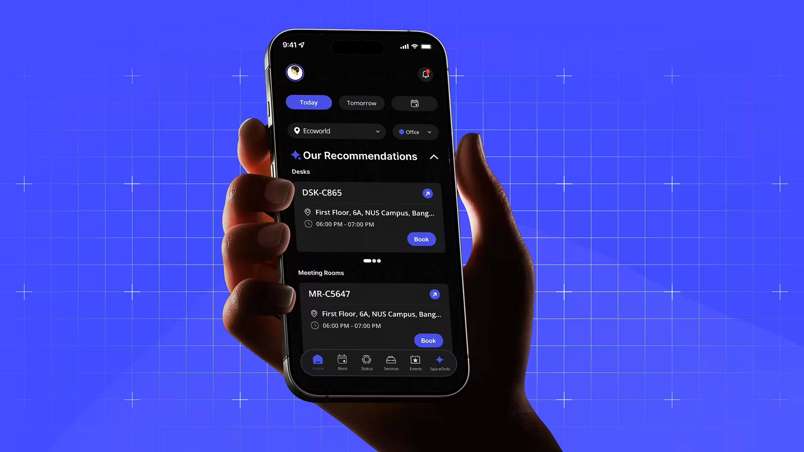
1. Simplified navigation Problem: overlapping actions and inconsistent labeling made the previous navigation unpredictable. Solution: restructured the information architecture around primary tasks, cutting unnecessary navigation depth. Principle: recognition rather than recall. Impact: –35% navigation errors.
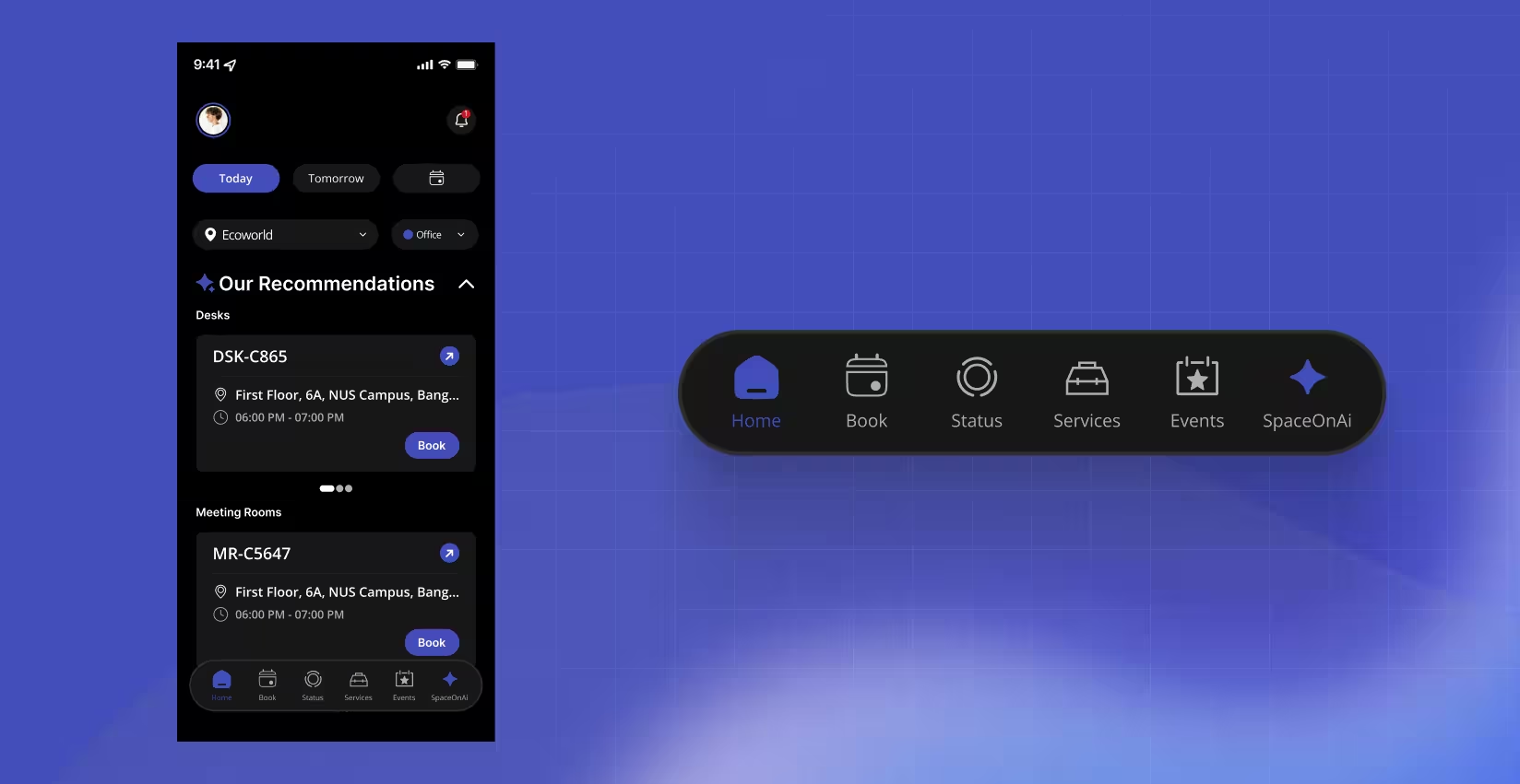
2. AI recommendations, made visible Problem: intelligent booking suggestions blended into the interface and went unnoticed. Solution: dedicated recommendation cards with concise reasoning, availability indicators, and a clear primary action. Principle: visibility of system status. Impact: +52% AI recommendation engagement.
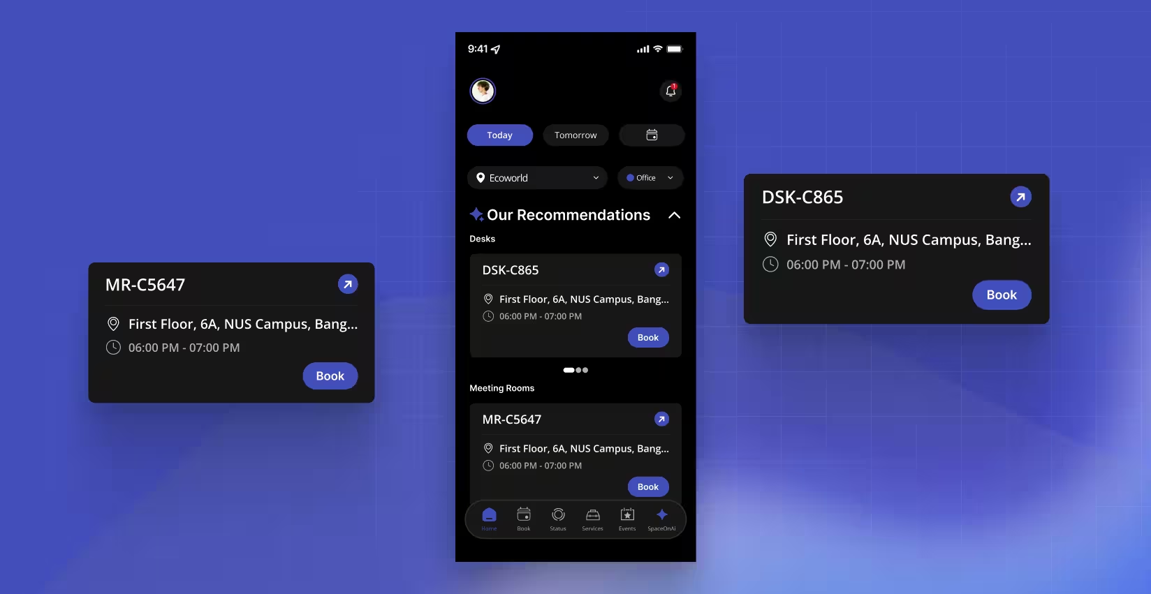
3. Dashboard redesign Problem: workplace information competed for attention with no clear priority. Solution: reorganized around progressive disclosure, surfacing upcoming bookings, quick actions, and personalized insights first. Principle: aesthetic and minimalist design. Impact: +31% dashboard engagement.
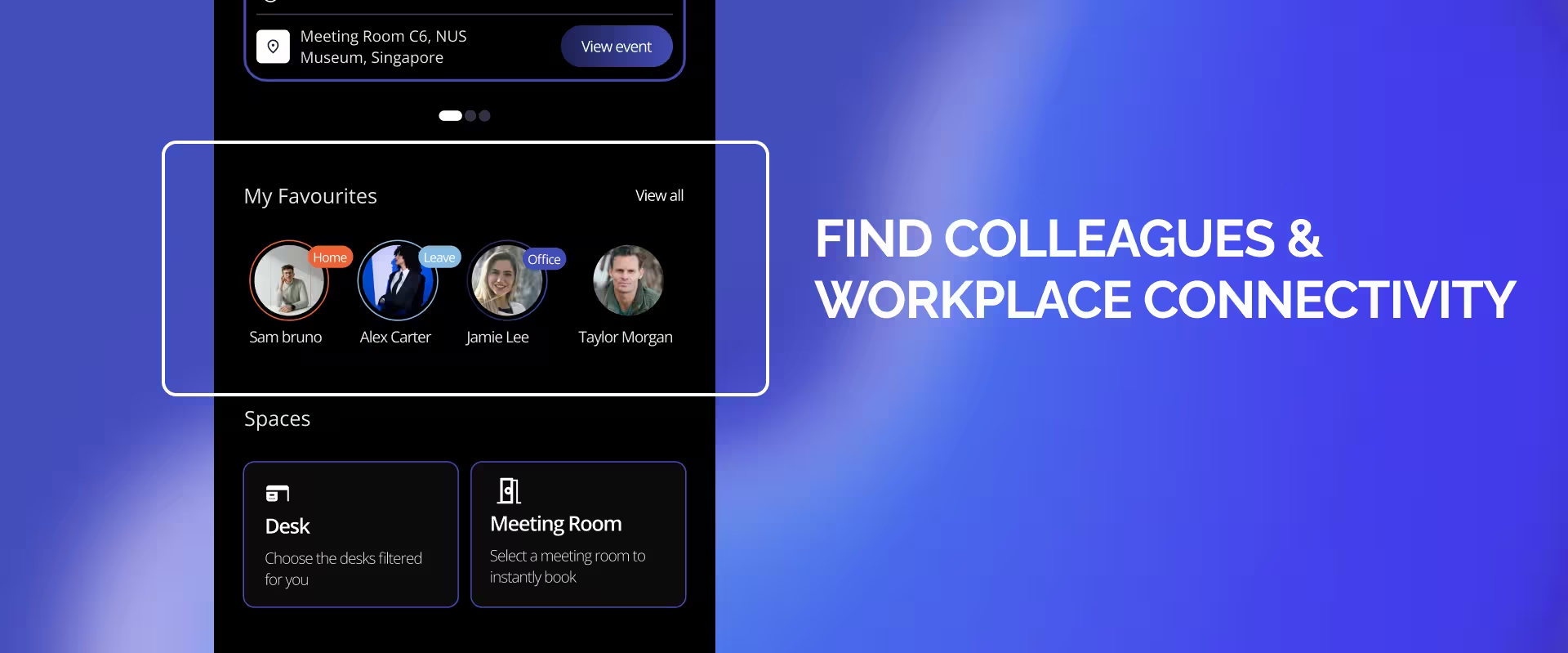
4. Streamlined booking flow Problem: completing a booking required unnecessary steps and repeated confirmations. Solution: consolidated decisions into fewer screens and reduced form complexity. Principle: user control and efficiency. Impact: –40% booking completion time.
Beyond the Core Flows
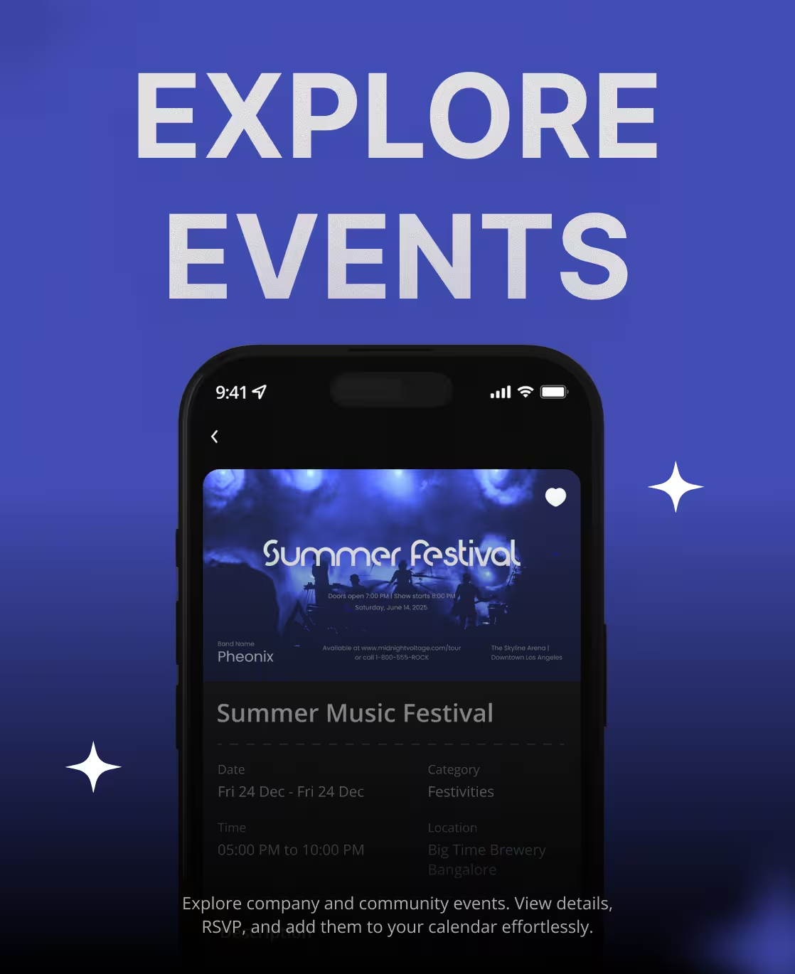
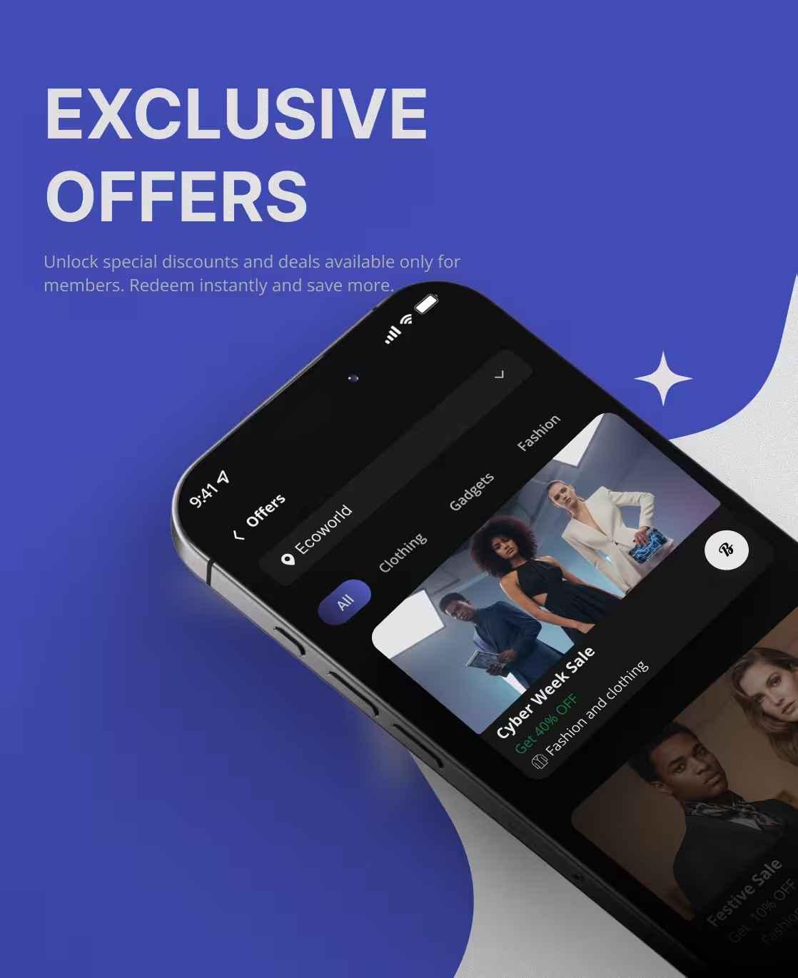
The same system extended into workplace services and the features that keep employees opening the app outside of booking:
Design System
A scalable component library replaced what had been inconsistent, one-off UI per feature:
Buttons, cards, bottom navigation, calendar components, booking cards, recommendation cards, status chips, search, filters, empty states, toast messages, and dialogs; each documented once and reused everywhere, which is what made faster feature development possible after handoff.
Accessibility
- WCAG AA contrast compliance
- Larger touch targets throughout
- Clearer typographic hierarchy
- Semantic structure for screen reader support
- Consistent interaction patterns across the entire application
Prototyping & Validation
High-fidelity prototypes were built in Figma and reviewed with product managers and engineering against representative enterprise workflows: booking a desk, reserving a meeting room, viewing upcoming reservations, accepting an AI recommendation, and managing existing bookings. Feedback from those reviews drove iterative refinement before developer handoff.
Product in Motion
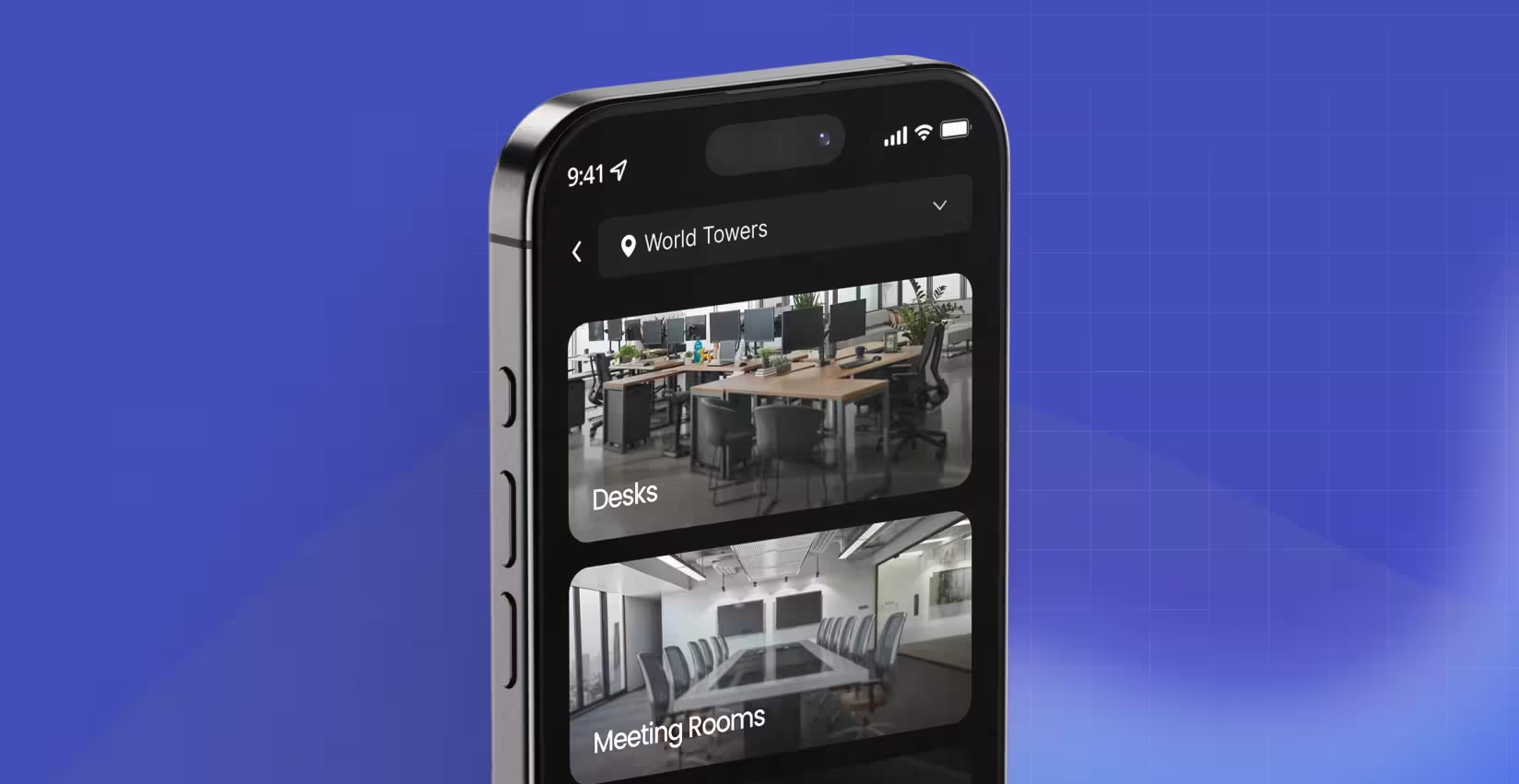
A walkthrough of the core booking flow: home recommendations through desk and meeting room confirmation.
The ticket chat flow, from raising a service request to tracking it through resolution.
The ticket chat flow, from raising a service request to tracking it through resolution.
Business Impact
+52%
AI recommendation usage
+36%
Feature adoption
+31%
Dashboard engagement
+44%
Task completion
-40%
Booking completion time
-35%
Navigation errors
+18%
Daily active users
+22%
User retention
-39%
Support requests
86/100
System Usability Score
Result
The redesign wasn't just a visual refresh; capability grew alongside it. What changed for employees wasn't only what SpaceOnAI could do, but whether they could find it, trust it, and use it in fewer steps than before.
Key Learnings
Enterprise applications succeed when they prioritize clarity over complexity. Even a feature-rich platform can feel intuitive once information architecture aligns with real workflows and high-frequency actions are surfaced where people actually look.
AI features earn adoption through transparency, not novelty: recommendations became more valuable the moment users could see the reasoning behind them, not just the suggestion itself.
And a consistent design system paid for itself twice: once in the immediate experience, and again in how much faster the next feature became to design and build on top of it.