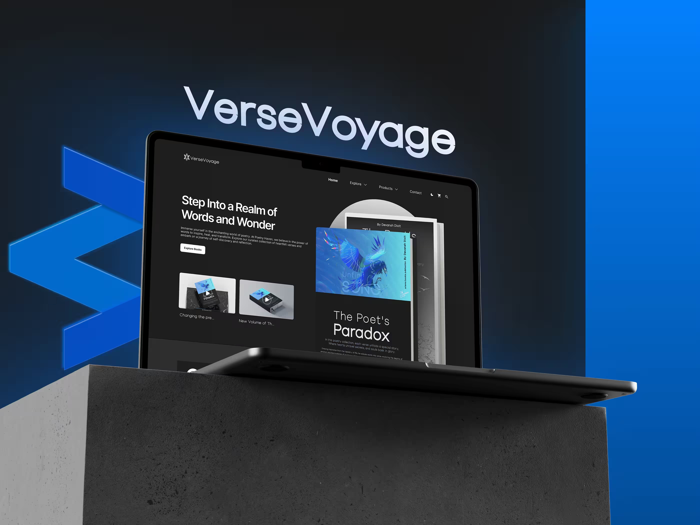
Personal Project
VerseVoyage
A concept reading platform for web and mobile, designed for readers who want discovery, organizing, and reading to feel as considered as the books themselves.
A motion treatment for the cover designs, built for use across app splash and marketing moments.
Overview
VerseVoyage is a concept reading platform for people who want a modern, immersive, distraction-free way to read. Most digital reading apps optimize for content delivery and stop there: navigation gets cluttered, discovery isn't personalized, and visual consistency is an afterthought. This project explores what changes when the reading experience itself gets the same design attention as the books it holds.
Built as a personal exploration across web and mobile, the scope covered the full interface, a custom design system, and a set of original book cover designs, created specifically to give the platform a cohesive visual identity instead of leaning on placeholder covers.
Project details
- Role: UI/UX Designer
- Type: Personal design project
- Platform: Web & Mobile Application
- Industry: Books & Digital Reading
Deliverables
- End-to-end UI design (web & mobile)
- UX design & information architecture
- Design system
- Custom book cover designs
- Interactive prototype
Background
Digital reading apps tend to accumulate function without accumulating design. Navigation gets overwhelming, discovery lacks any real personalization, and visual consistency erodes as features pile on.
The question behind VerseVoyage was simple: could a reading platform feel calm, premium, and emotionally engaging without sacrificing intuitive navigation? Not a replica of existing reading apps, but an attempt to make discovery effortless and staying immersed the default state, not something the user has to fight the interface for.
Objectives
- Create a clean, modern reading experience
- Improve book discovery through intuitive navigation
- Design a distraction-free reading interface
- Establish a premium visual identity
- Explore typography-focused UI design
- Build a scalable design system for future expansion
Design Process
Research
Studied common reading habits and existing digital reading experiences.
Competitive review
Studied leading book platforms to identify where the experience could be sharper.
Information architecture
Defined the app's structure around the primary reading journey.
Wireframes
Low-fidelity flows to lock navigation and content hierarchy before visual design.
High-fidelity UI
Full interface design across web and mobile.
Component library
Built reusable UI components for consistency and future scale.
Prototype
An interactive prototype connecting discovery through to the reading experience.
The focus throughout wasn't replicating existing reading apps; it was identifying where a cleaner, more engaging experience with stronger visual storytelling could exist instead.
Information Architecture
Navigation was organized around the reading journey itself: Home, Explore, Library, Reading Progress, Wishlist, Profile, with frequent actions kept close, secondary features still reachable without adding navigation depth.
A typical path moves from discovering new books, through recommendations and book details, into saving titles to a personal library, and finally into the reading experience itself, designed to minimize friction at every handoff between discovering and reading.
UX Decisions
Personalized home experience The home screen surfaces recently read books, personalized recommendations, trending collections, and curated categories immediately, with no unnecessary navigation between "I want to keep reading" and "I want to discover something new."
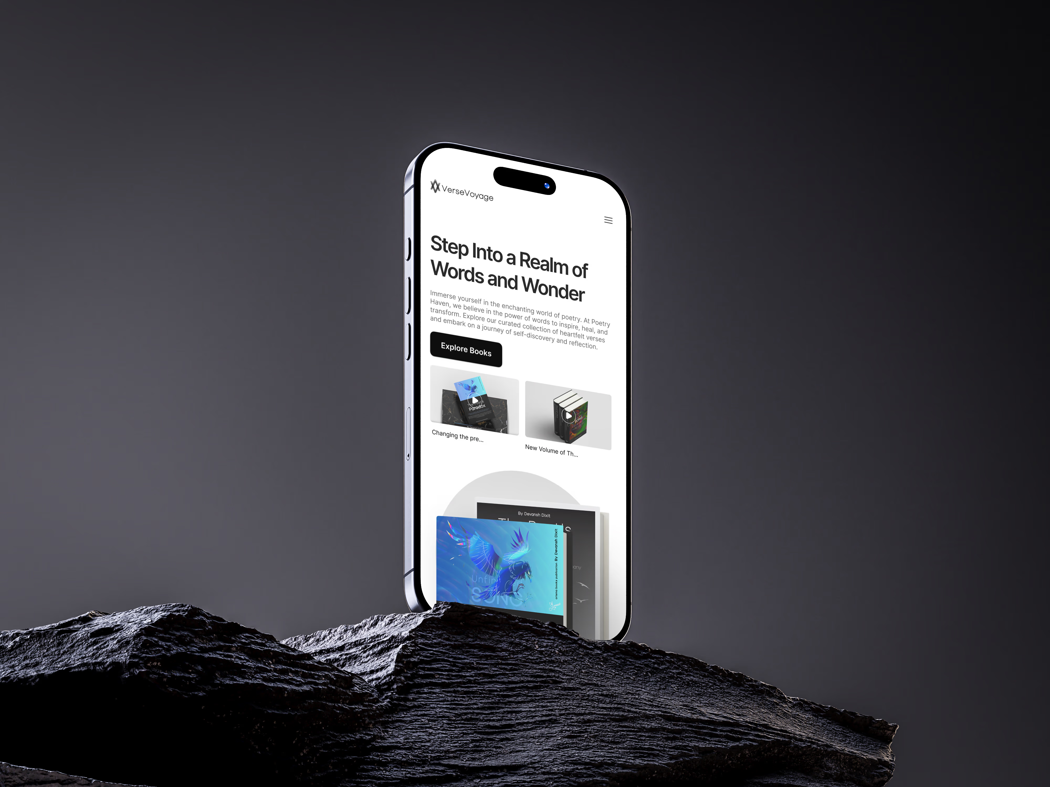
Simplified book discovery Exploration is built around intuitive browsing rather than dense lists: genres, featured collections, popular titles, and recommendations organized into visually distinct sections instead of one long scroll.
Browsing from home through genre discovery and book detail.
Distraction-free reading The reading interface leans entirely on typography, spacing, and visual comfort. Controls stay unobtrusive: present when needed, invisible when they'd otherwise compete with the page.
Library management The personal library gives a structured view of saved books, reading progress, favorites, and completed titles, with visual progress indicators so resuming an unfinished book takes one glance, not a search.
Moving from the personal library into the distraction-free reading view.
Consistent navigation Primary navigation stays persistent across the entire app, so moving between discovery, reading, and personal collections never costs the user their place.
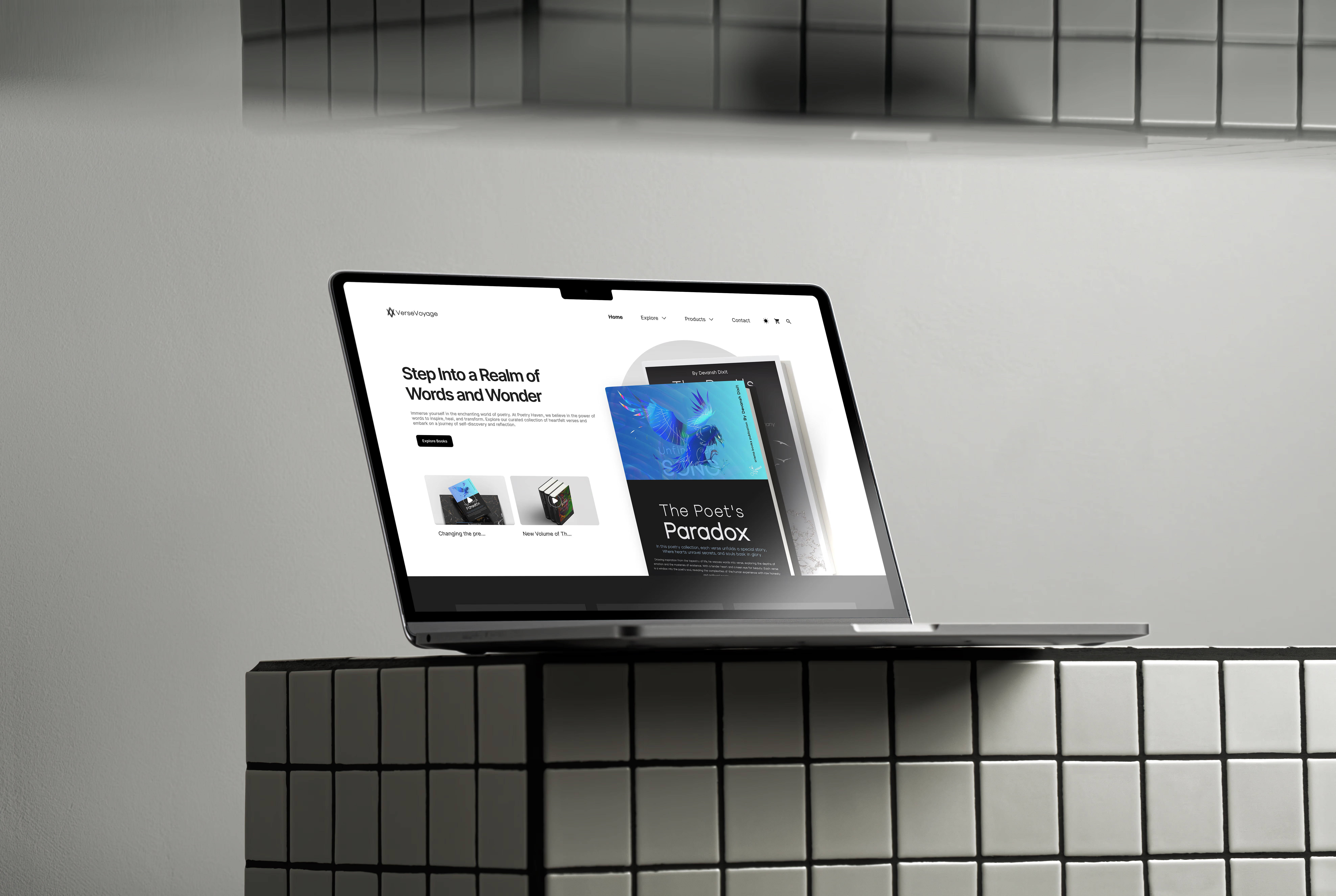
On the Web
Custom Book Cover Design
Rather than filling the interface with placeholder covers, I designed a set of original book covers specifically for VerseVoyage, each one built to reinforce the platform's visual identity and hold up recognizably even at small mobile card sizes.
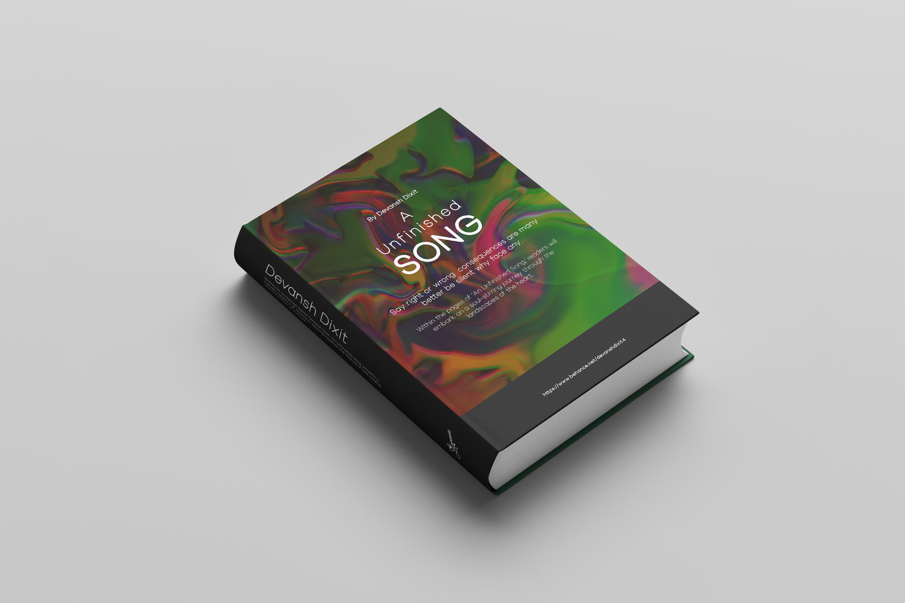
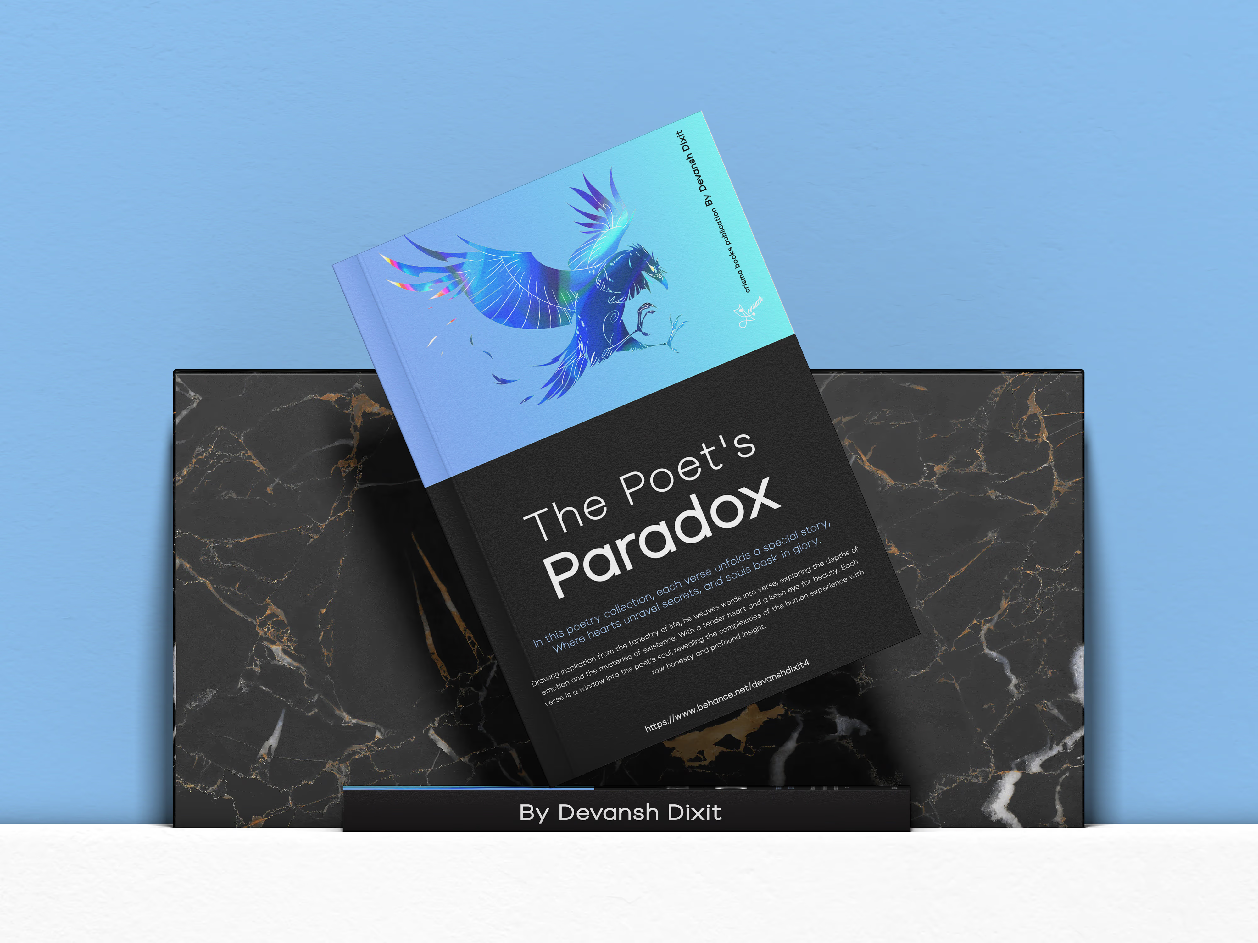
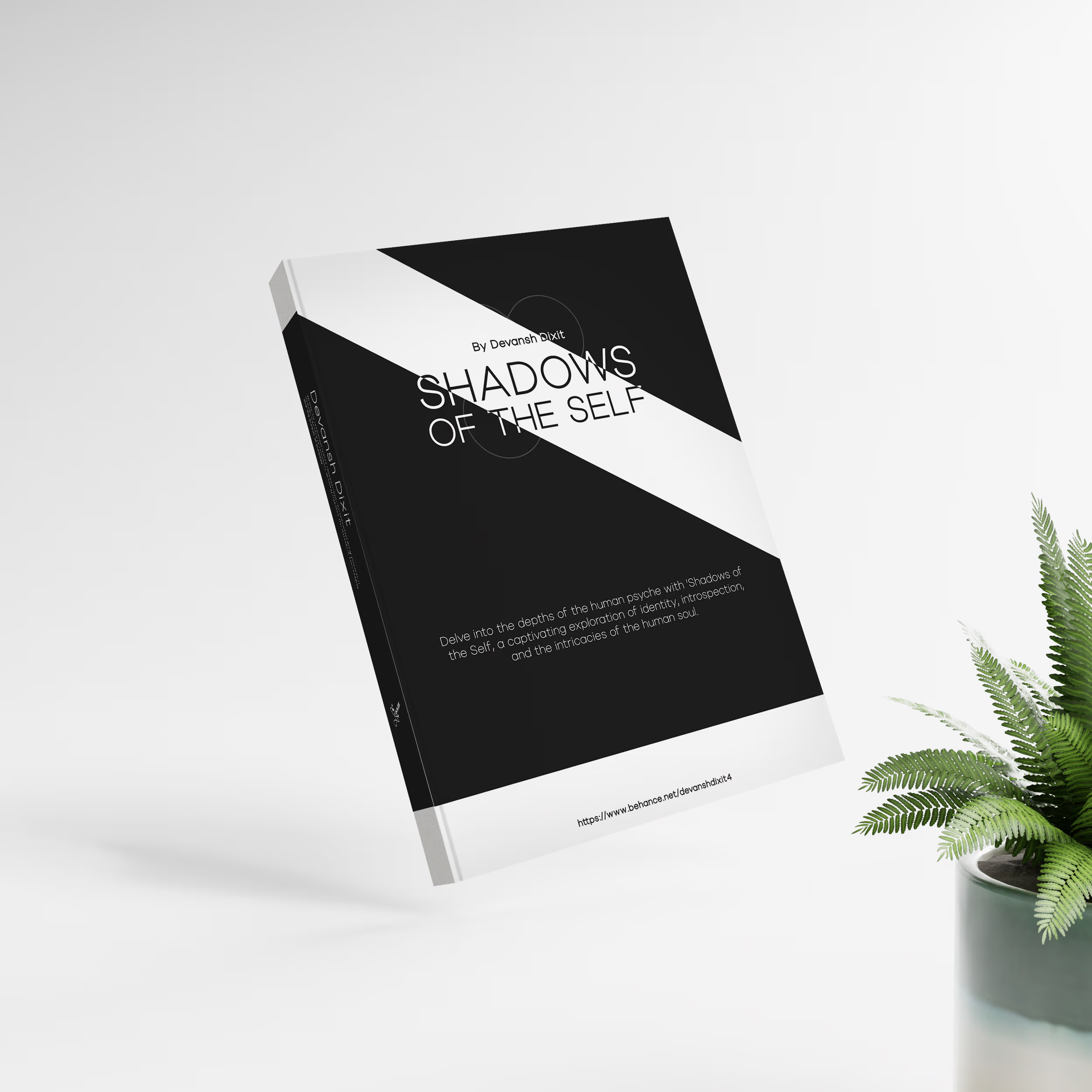
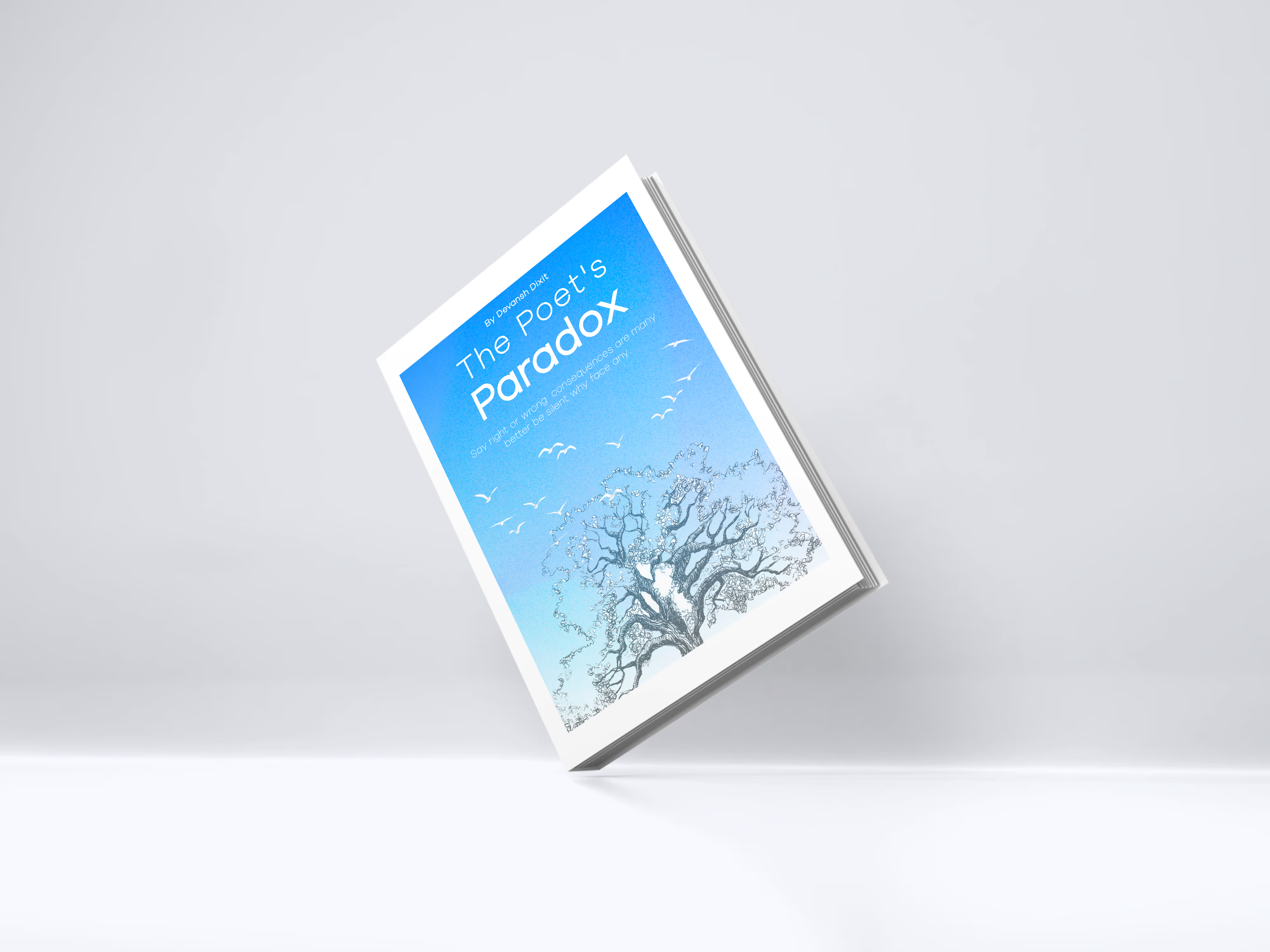
Each cover explored a different visual language on purpose: graphic type-led minimalism, illustrated fantasy linework, abstract color-field composition, while staying legible as a thumbnail, which was the real constraint behind every one of them.
Visual Design System
The interface follows a modern editorial aesthetic, closer to premium publishing than a typical app UI. The system covers:
Color palette, typography scale, buttons, book cards, navigation components, search interface, progress indicators, collection cards, profile components, reading controls, empty states, and icons: a single reusable library rather than one-off screens.
Accessibility
- High-contrast typography
- Comfortable reading line lengths
- Consistent spacing and hierarchy
- Large touch targets
- Readable font sizes
- Clear visual feedback for interactive elements
Final Outcome
VerseVoyage shows how far interaction design and visual storytelling can take a traditional reading app concept: intuitive navigation, editorial-inspired layouts, an immersive reading screen, and a cohesive identity that includes original book cover design rather than borrowed assets.
Key Learnings
This project sharpened how I think about content-first design, where typography, spacing, and hierarchy aren't decoration, they're the usability. Building the full visual ecosystem, interface components and book covers alike, reinforced how much consistency across product and brand identity actually matters, even on a project with no client holding me to it.
It was also a chance to see how much small interaction and visual detail can shift the emotional read of a product: the difference between an app that works and one that feels like it was made for the person using it.