Case Study
Whizkerz
A logo mark for a pet-parent social app, built around one idea: a dog and a cat, sharing the same letter, without either one disappearing.
Overview
Whizkerz is a community app for pet parents: a place to find fellow pet lovers nearby, share your pet's moments, and document their journey through posts and stories. Not a marketplace, not a vet-services app. A social space, built around a very specific kind of love.
The brief was a logo and identity system that could carry that specificity: warm enough for a dog-mom's Instagram energy, credible enough to not read as a novelty sticker pack.
Highlights
- A negative-space W mark combining a dog and a cat silhouette into one letterform
- A restrained teal-and-neutral palette built for both light and dark surfaces
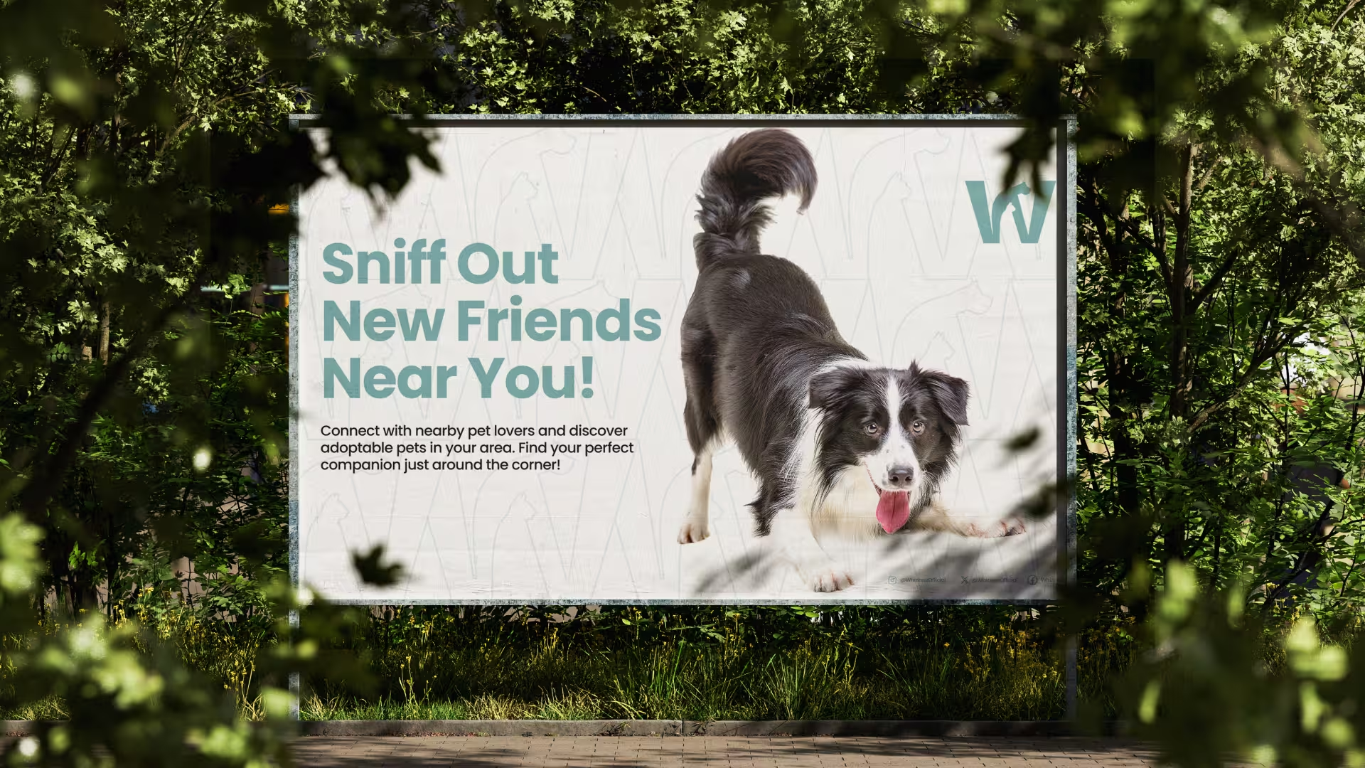
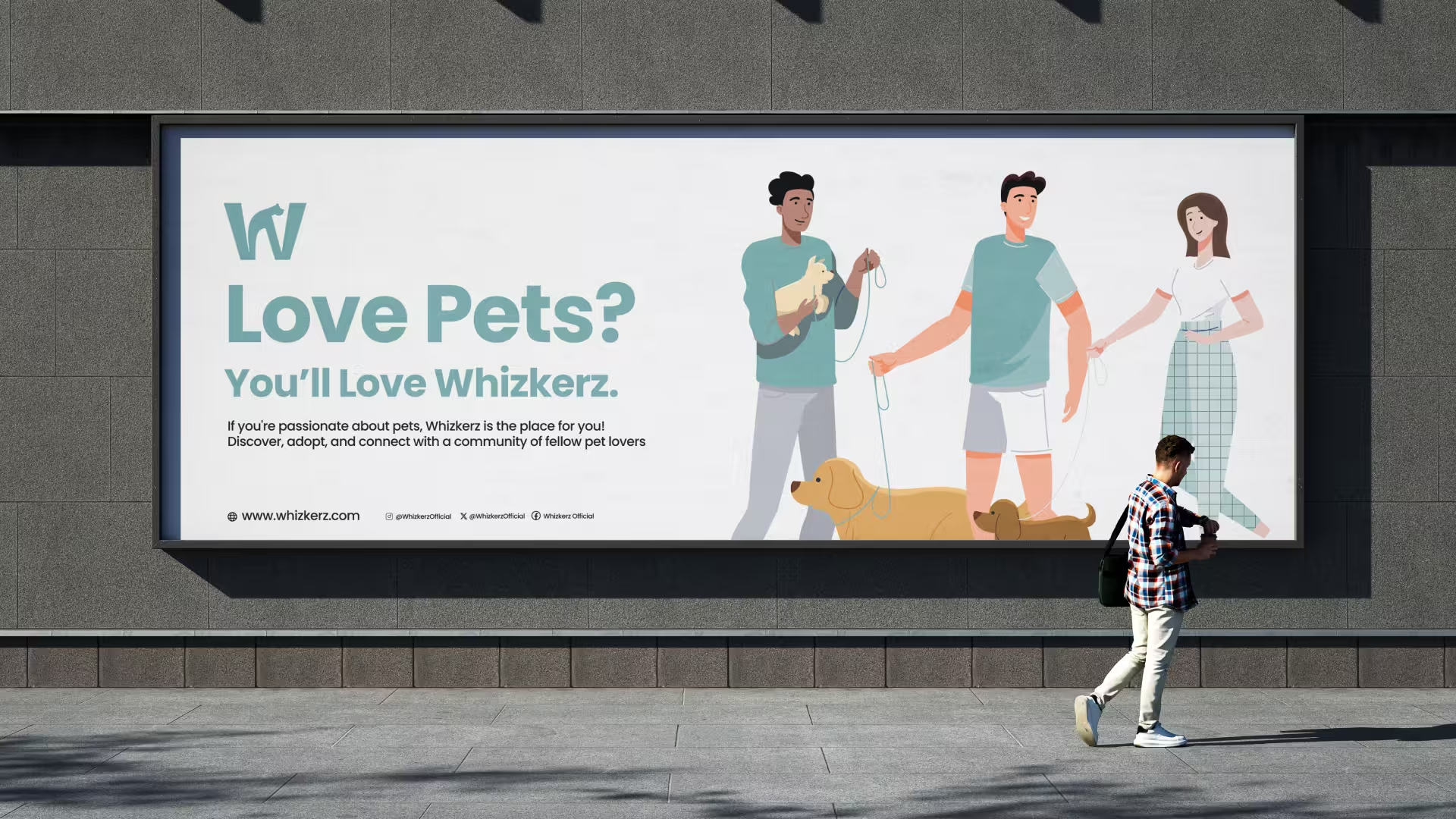
- A full application system, covering app icon, favicon, pattern, packaging, merch, and outdoor ads
- A logo reveal animation for app splash and social use
The Brief
Pet-parent apps tend to fall into one of two traps: cartoonish and cute to the point of feeling unserious, or generic tech-startup clean with a paw print bolted on as an afterthought. Neither fit what Whizkerz actually is: a genuine community space people return to daily.
The mark needed to do three things at once:
- Signal "pets" instantly, without relying on a literal paw icon
- Work as a single-letter app icon at 40px and as a wordmark at billboard scale
- Feel warm without tipping into juvenile
Exploration
Early direction work moved through a few dead ends before landing on the final concept. A literal paw-print mark read too generic: it's the default symbol for every pet brand, and it doesn't say community. A dog-only silhouette favored one half of the audience over the other, which worked against the "cat guardian, dog lover, or exotic companion" positioning in the brief. A pure wordmark, no symbol, was clean but forgettable, with nothing to anchor the app icon.
The direction that won combined the brand's own initial with its subject matter directly: a dog and a cat, drawn as one continuous line, sitting inside the negative space of a lowercase-feeling "W."
Note for later
Sketch and alternate-direction visuals from this phase aren't in the current asset set; worth adding here once available, since this section currently has no supporting image.
The Concept
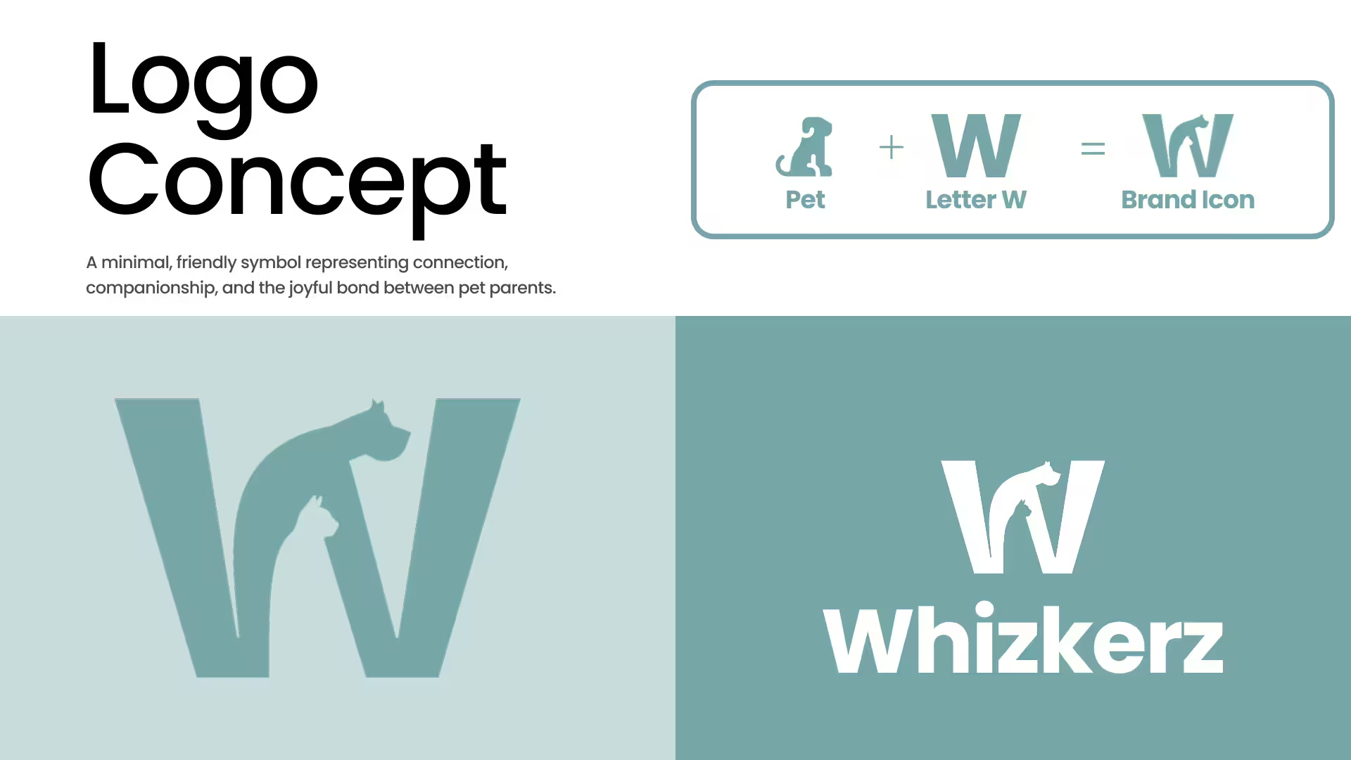
The dog's arched back becomes the W's left stroke. The cat's raised tail becomes the connecting valley. Read fast, it's a bold geometric W. Read slow, it's two animals, mid-motion, close together, which is closer to what the app is actually for.
“Where Pet Parents Connect.”
What the Mark Needed to Say
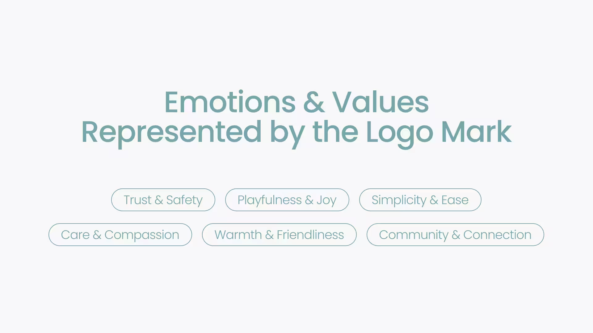
Trust and safety, playfulness and joy, simplicity and ease, care and compassion, warmth and friendliness, community and connection. Six words, but really three tensions to hold at once: playful without being childish, simple without being cold, warm without being soft.
Color
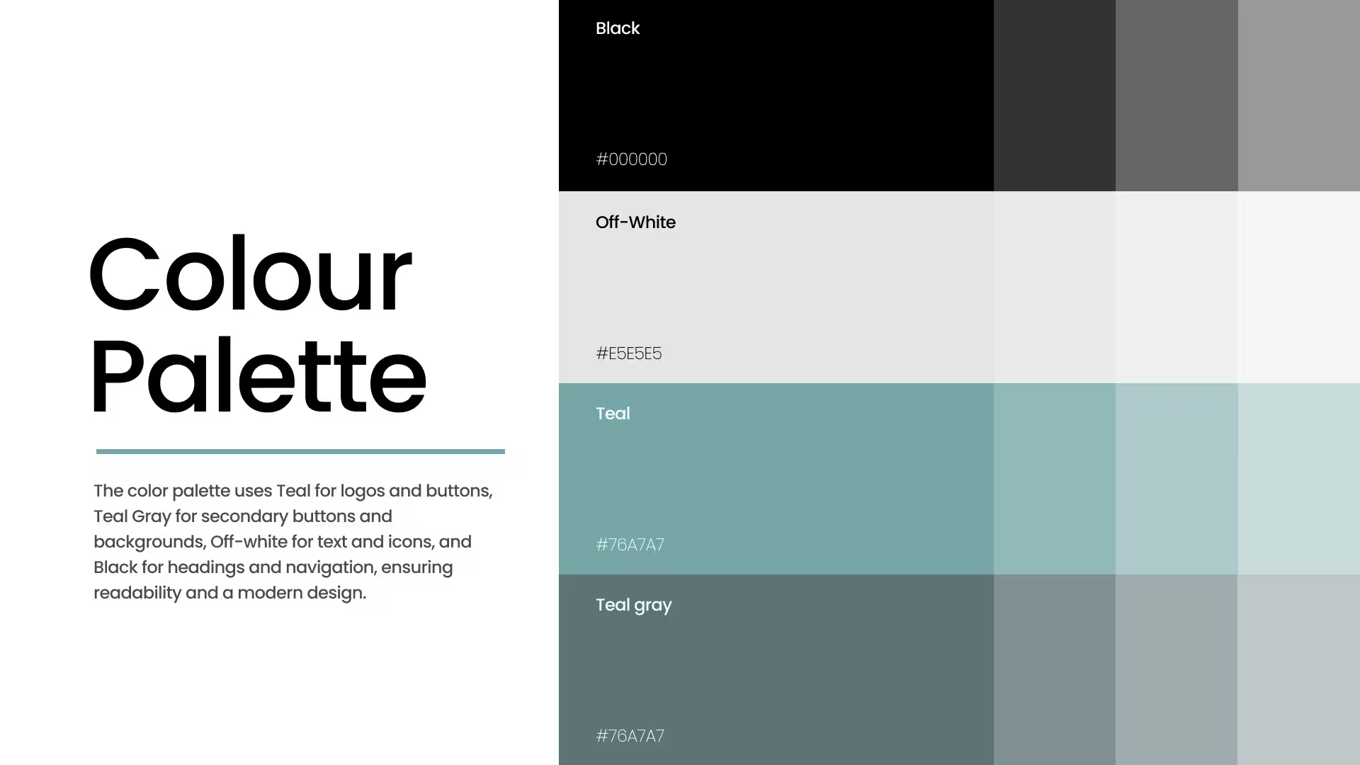
Teal was chosen over the more expected warm-orange or grass-green pet-brand palette specifically because it doesn't compete with pet photography: most of the app's real content is photos of animals in every color imaginable, and the brand color needed to frame that, not fight it.
Typography
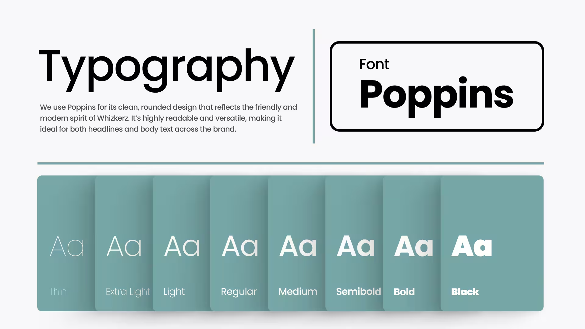
Poppins' geometric roundness matches the logo's own construction: the same soft-cornered confidence, just in type form. One family, eight weights, no second typeface to manage.
Pattern
Applications
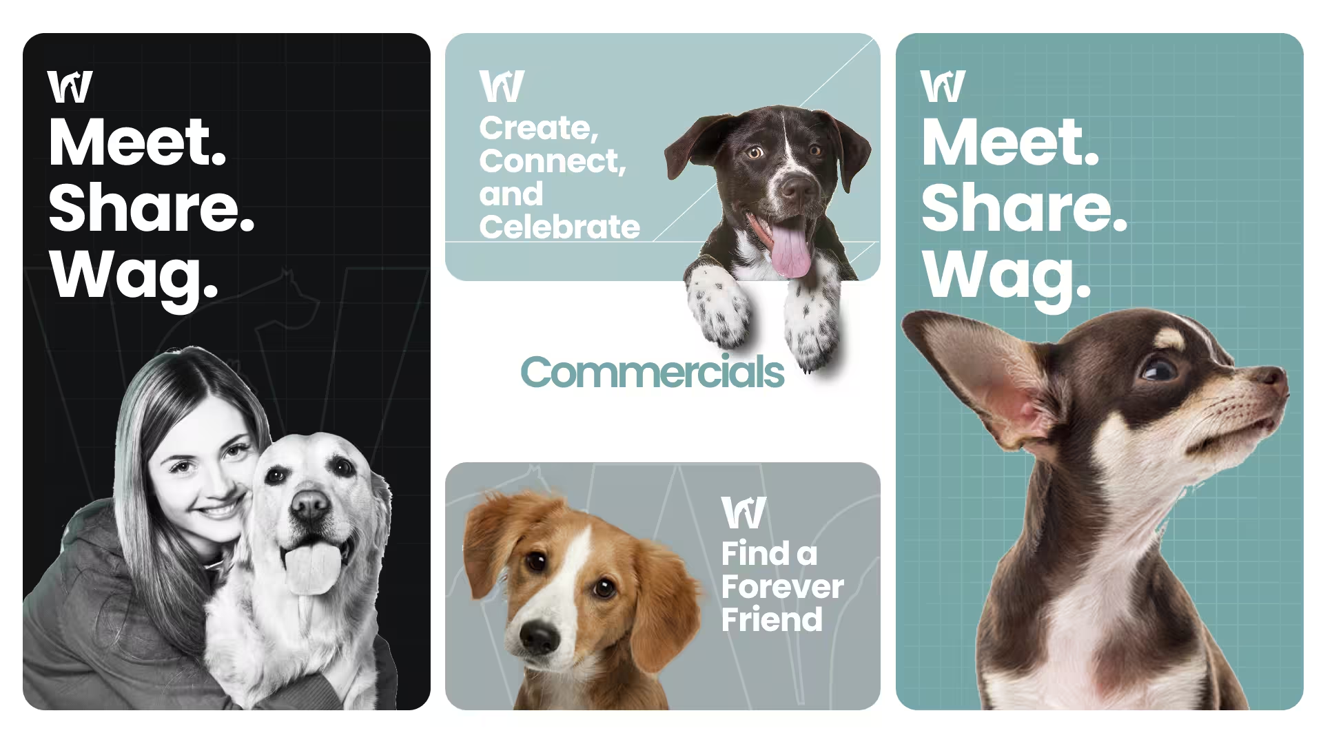
A mark only proves itself once it leaves the presentation deck. Here's the system holding up across the surfaces that actually matter day to day.
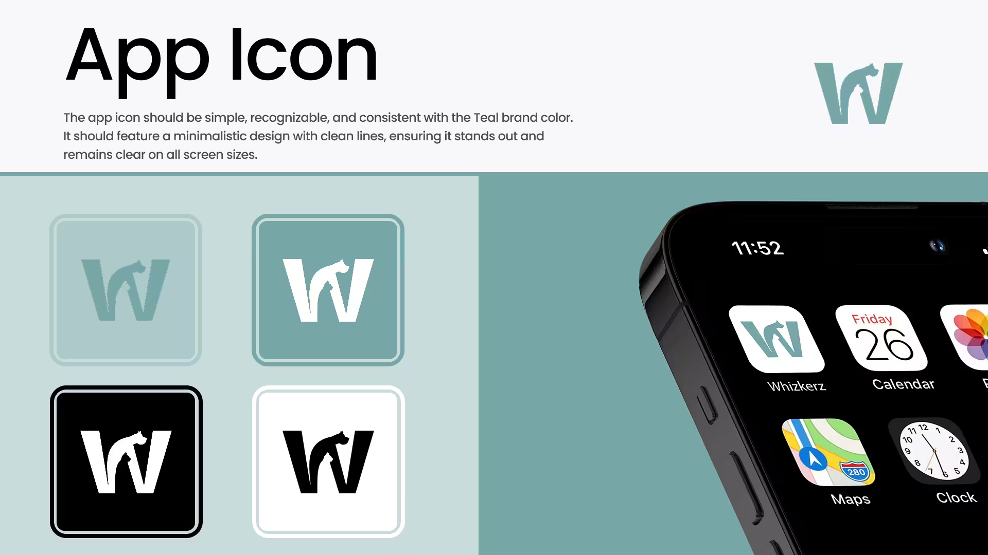
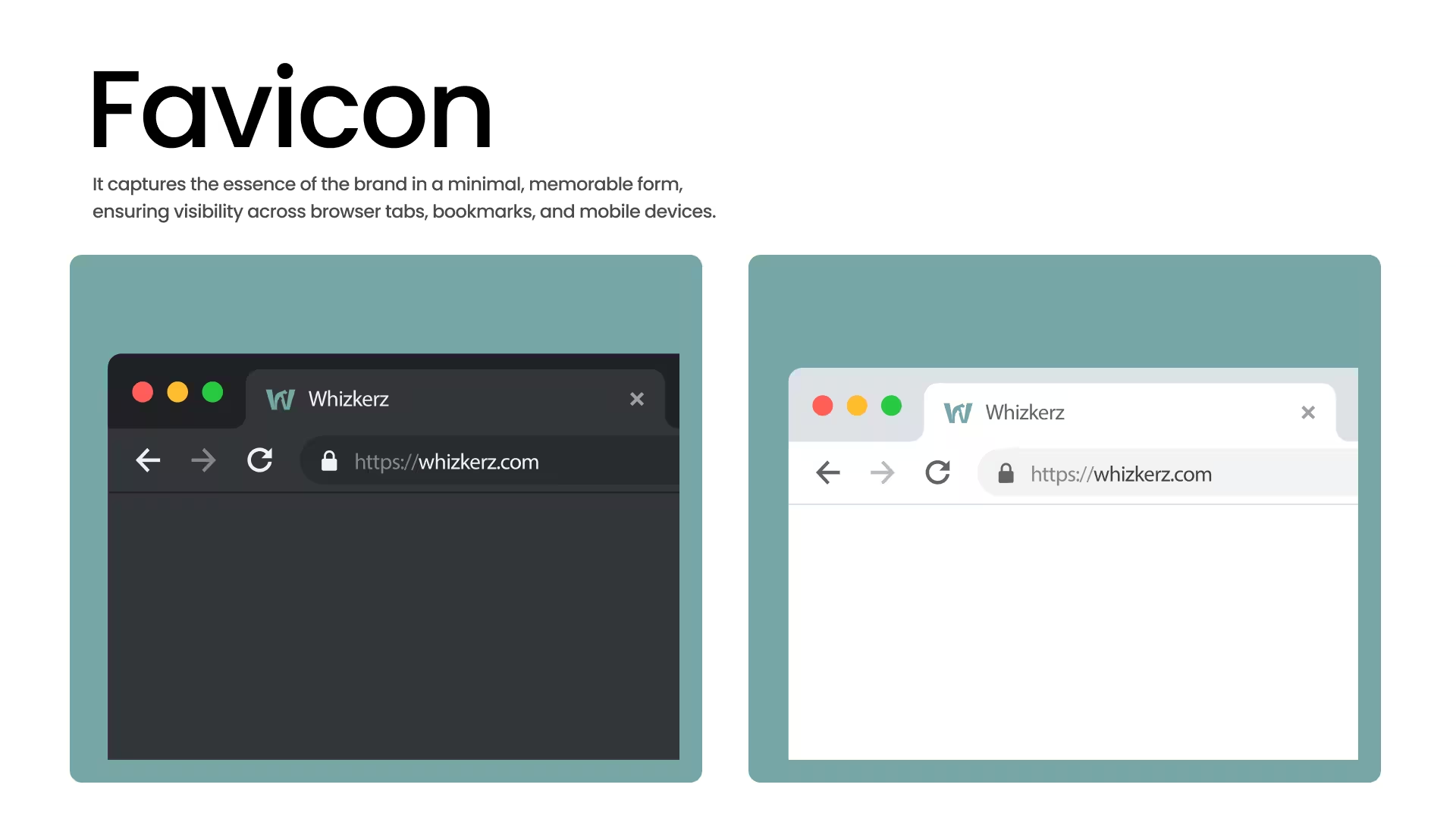
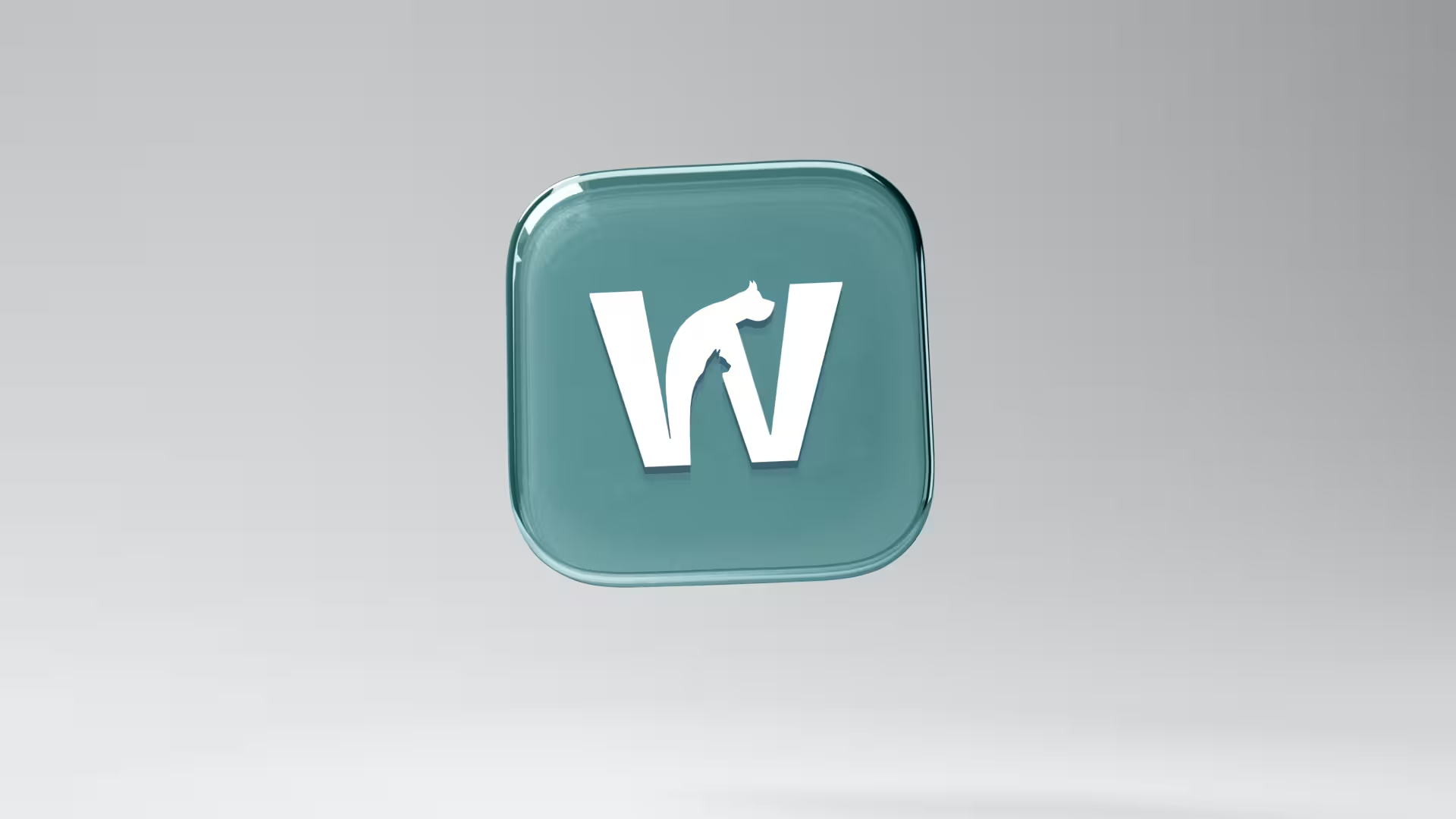
The app icon ships in four states (full teal, white-on-teal, white-on-black, and black-on-white) so it holds up whether a phone is set to light or dark mode. The same mark drops cleanly into a 16px browser favicon without losing the dog-and-cat detail, which was the real test of whether the concept was simple enough.
Out in the World
Merchandise & Packaging
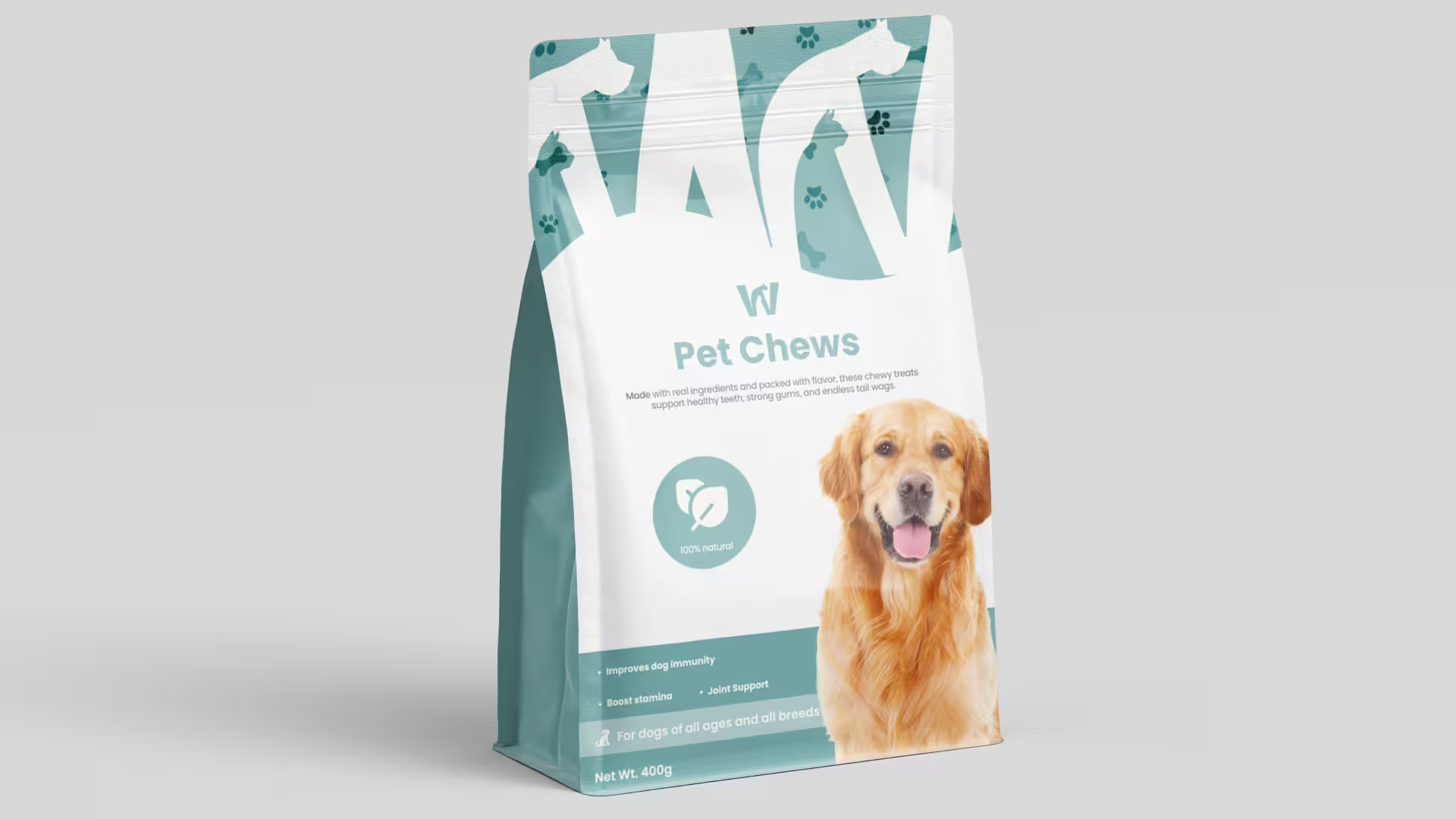
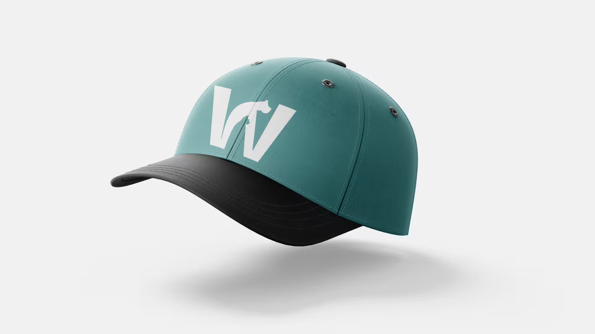
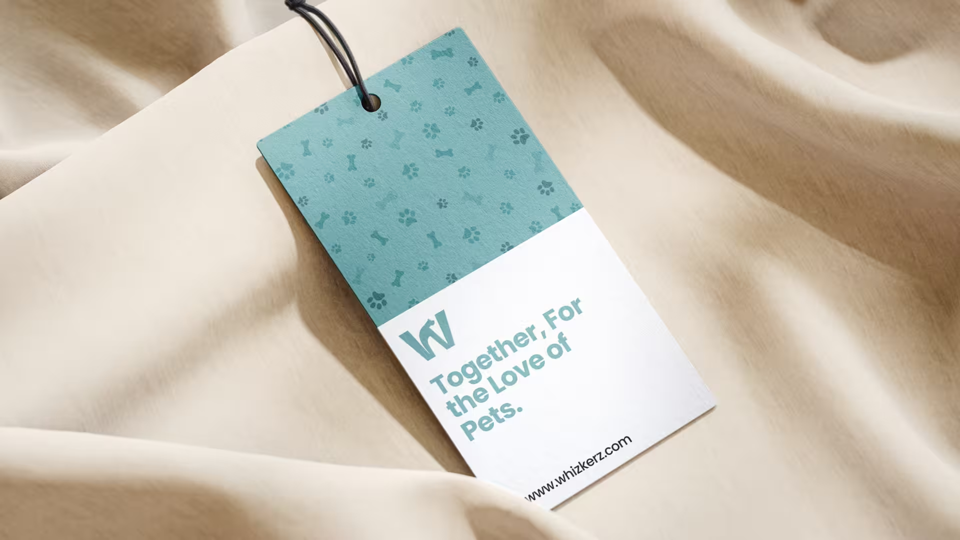
Packaging, apparel, and a hang tag: three surfaces with three very different production constraints (print bleed, embroidery simplification, die-cut card stock), and the mark needed to survive all three without a redraw. It did, apart from minor stroke-weight adjustments for embroidery on the cap.
Logo in Motion
A short reveal animation built for the app splash screen and social intros: the dog and cat silhouettes draw in first, then the W resolves around them.
Reflection
What worked
- Building the mark from the letterform outward, rather than adding an animal icon next to type, made it read as one idea instead of a logo-plus-mascot.
- Testing the icon at 16px early caught detail that wouldn't survive scaling down, before it got locked into brand guidelines.
- A single typeface across the full weight range kept the system simple enough for a small team to apply consistently.
What I'd do differently
- Document the early paw-print and dog-only directions properly; they're referenced in the narrative here but weren't preserved as presentable artifacts.
- Test the mark against more exotic-pet imagery earlier: the current system leans dog-and-cat, and the brief explicitly includes "more exotic companions."
- Get embroidery and print production constraints into the review earlier, rather than adjusting stroke weights after the merch mockups were already built.
Outcomes
- Delivered a complete identity system (logo, color, type, pattern, and application guidelines) in a single brand guidelines document
- Built an app icon that holds its detail down to 16px across four color states
- Extended the mark across sixteen real-world applications, from billboard to hang tag, without redrawing the core symbol
- Produced a logo reveal animation for app splash and social use
The mark works because it refuses to pick a side: dog or cat, playful or credible, icon or letterform. It's not a paw print with a brand name next to it. It's the brand name, drawn as the thing it's actually for.